Color 2
WEEK 1 - JUNE 9 - SLIDE SHOW - analogous plus a complementary

WEEK 2 - JUNE 16 - USING CONTRAST IN COLOR (NO SLIDE SHOW)
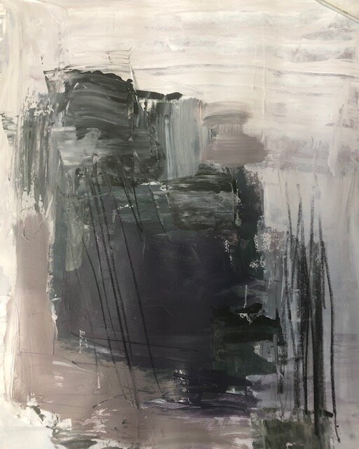
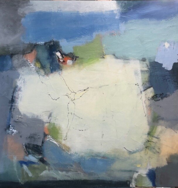
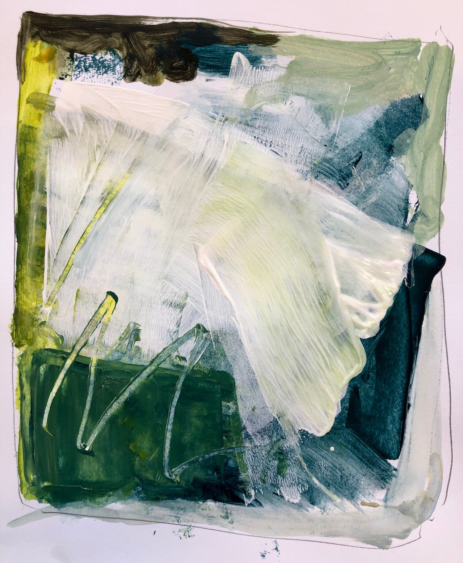
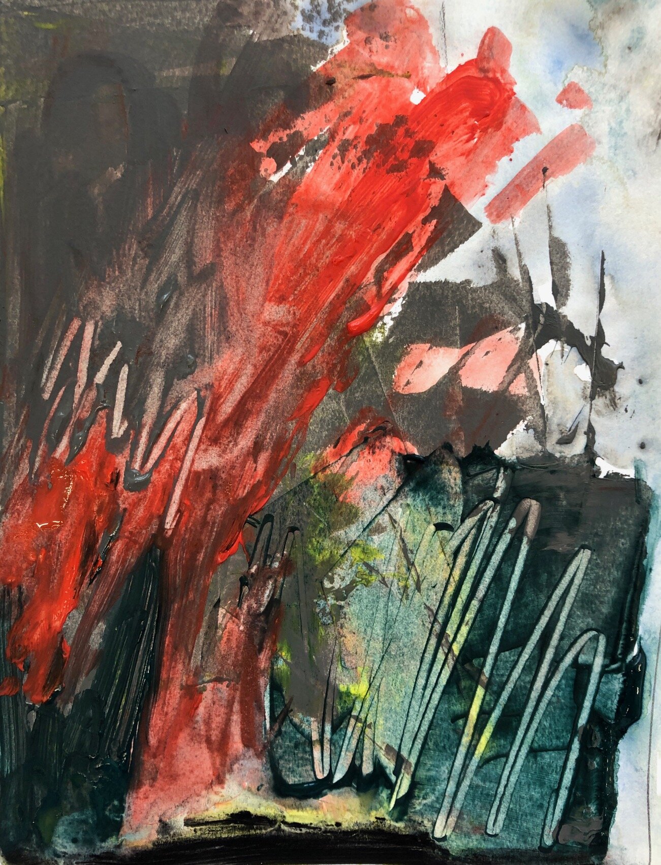
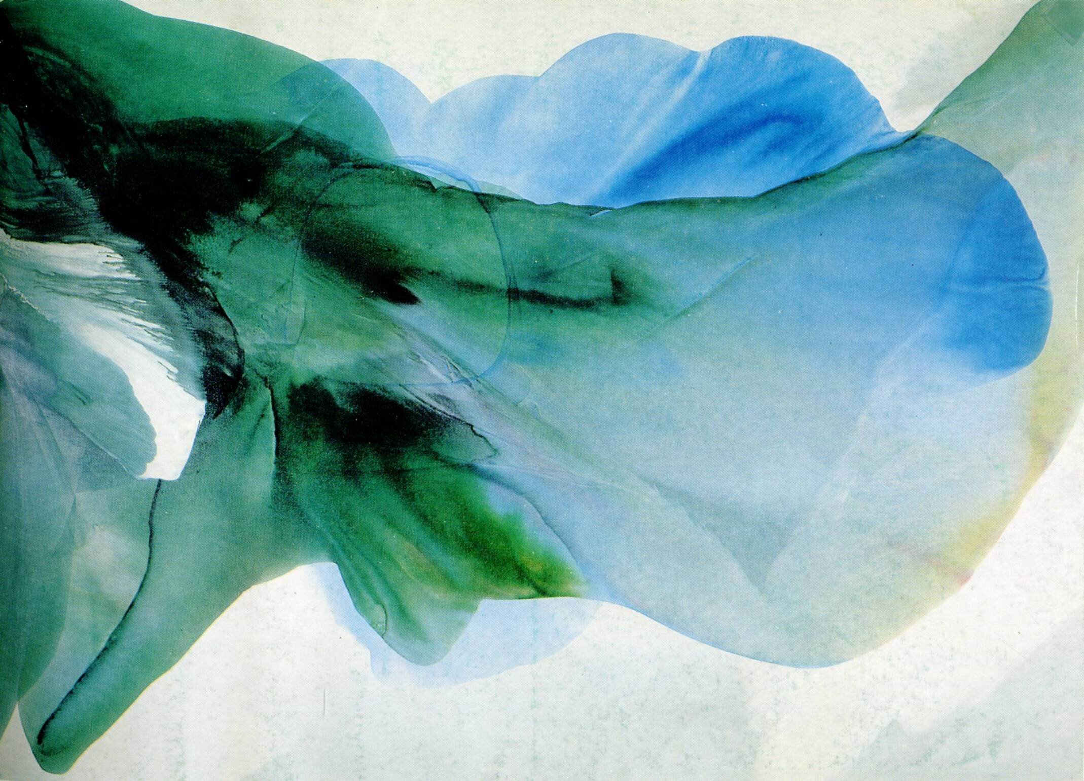
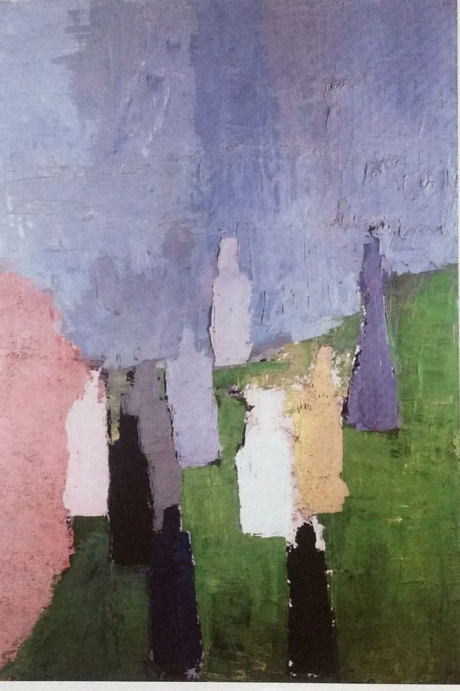
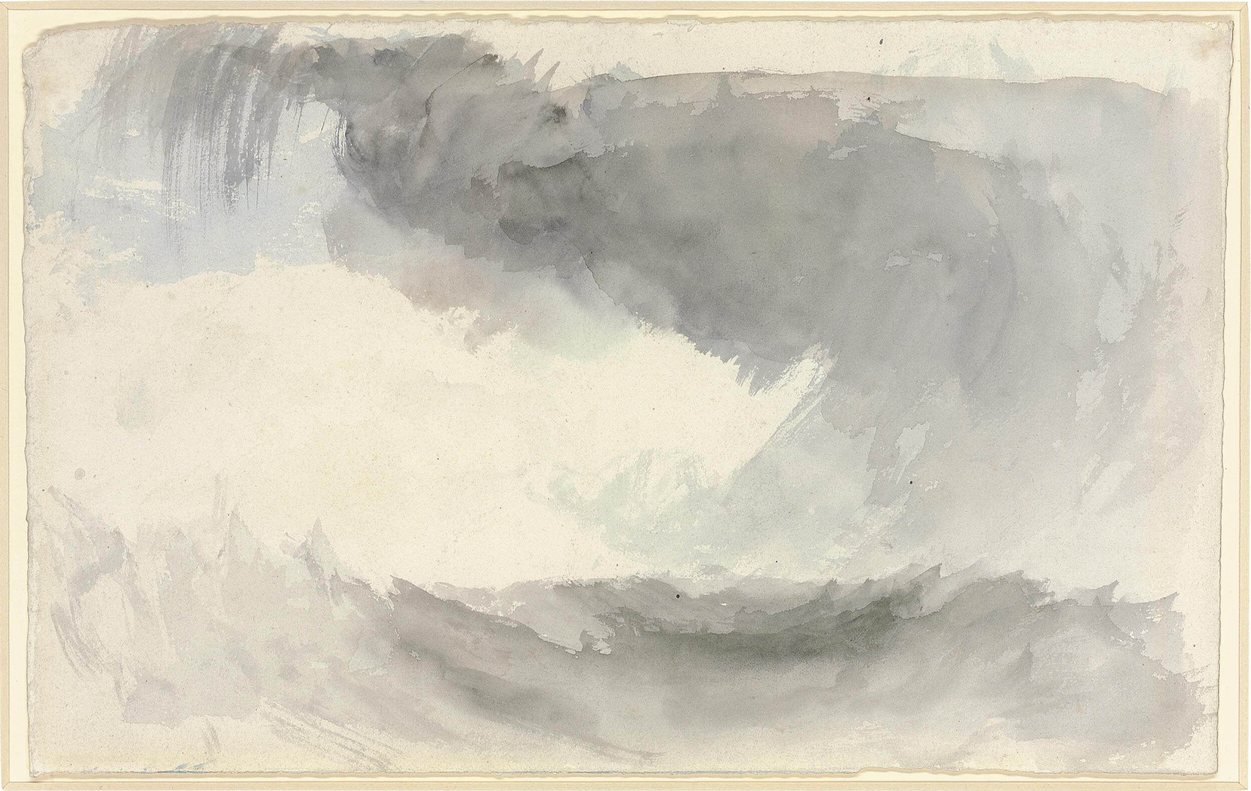
Week 3 - JUNE 23 - SLIDE SHOW - USING COLOR TO CREATE DEPTH
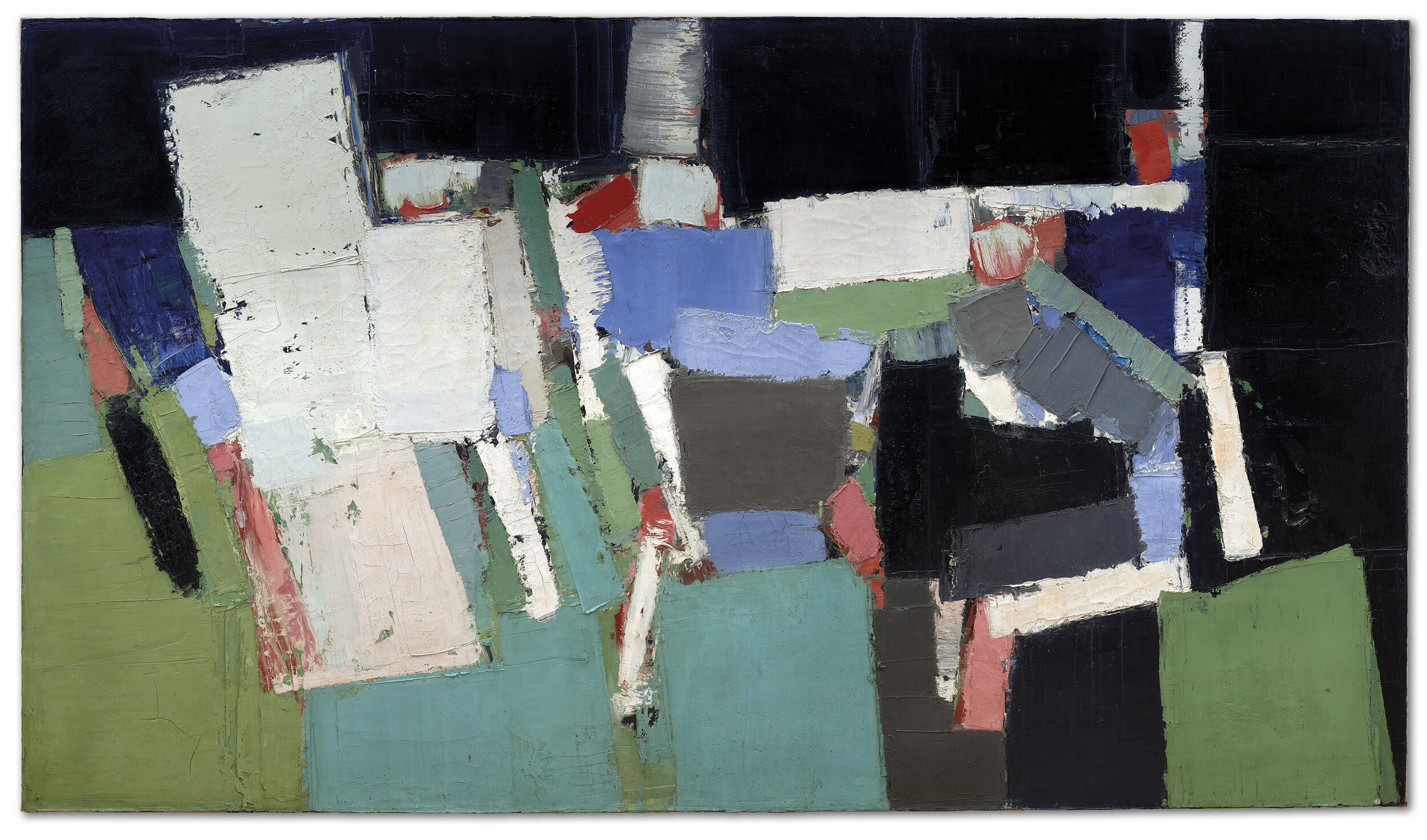
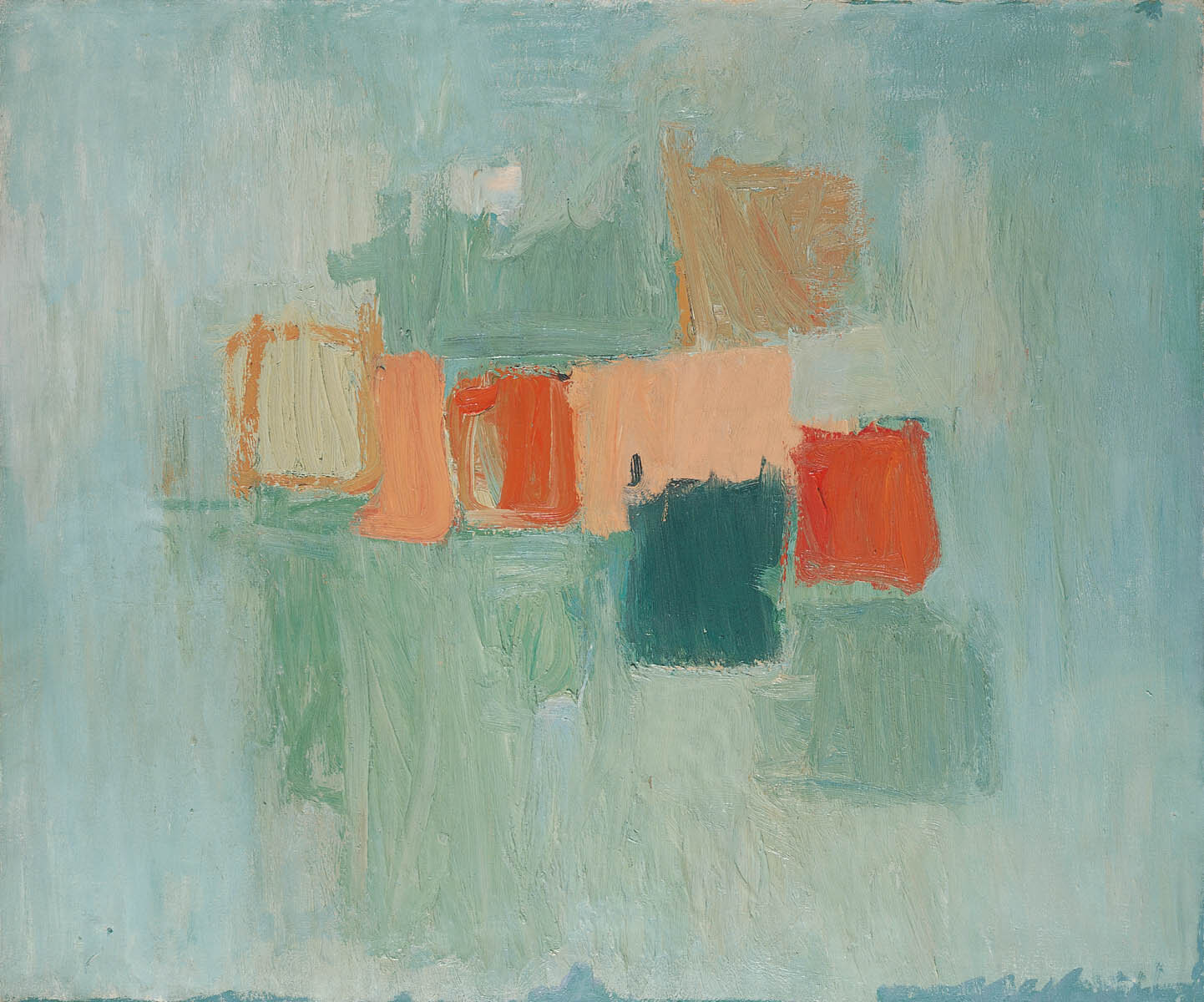

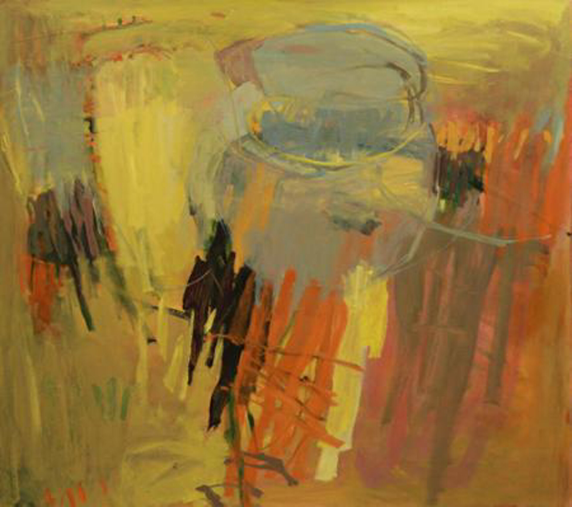
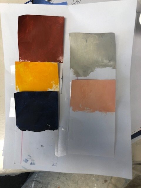
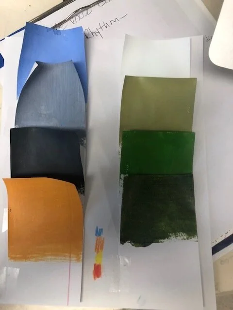
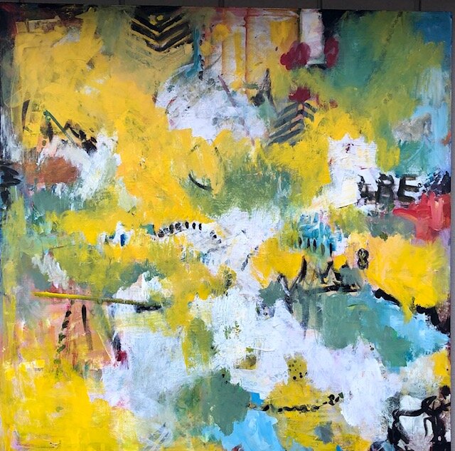
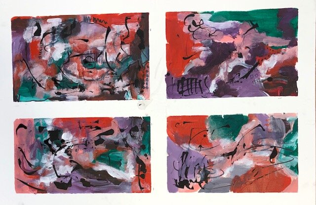
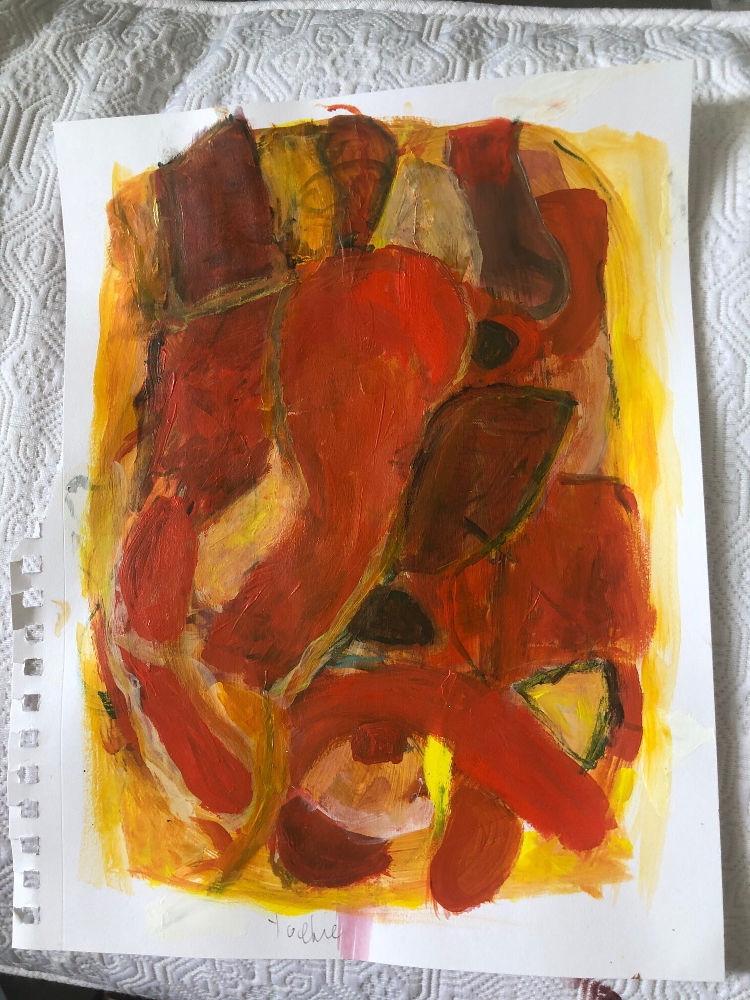
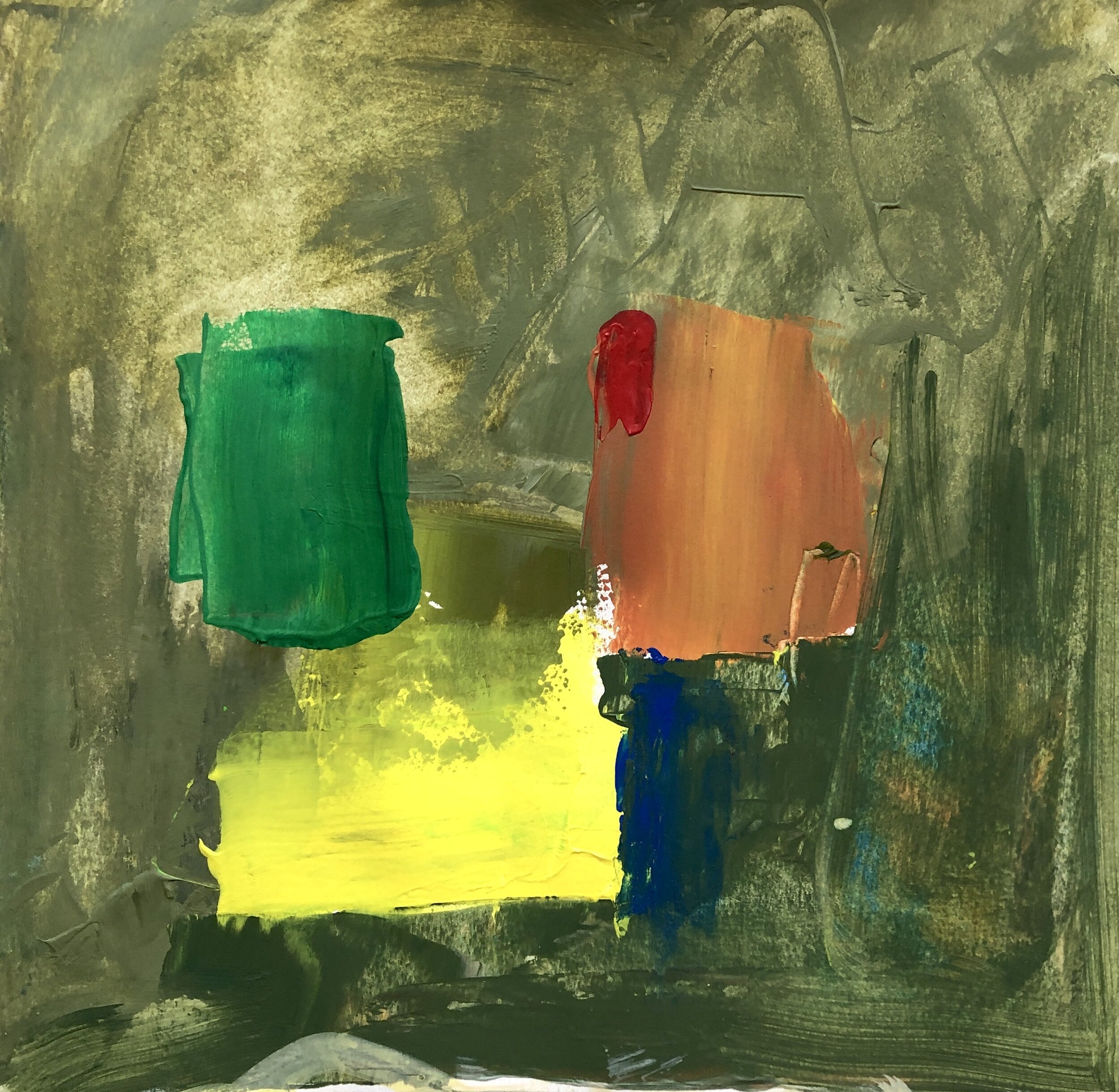
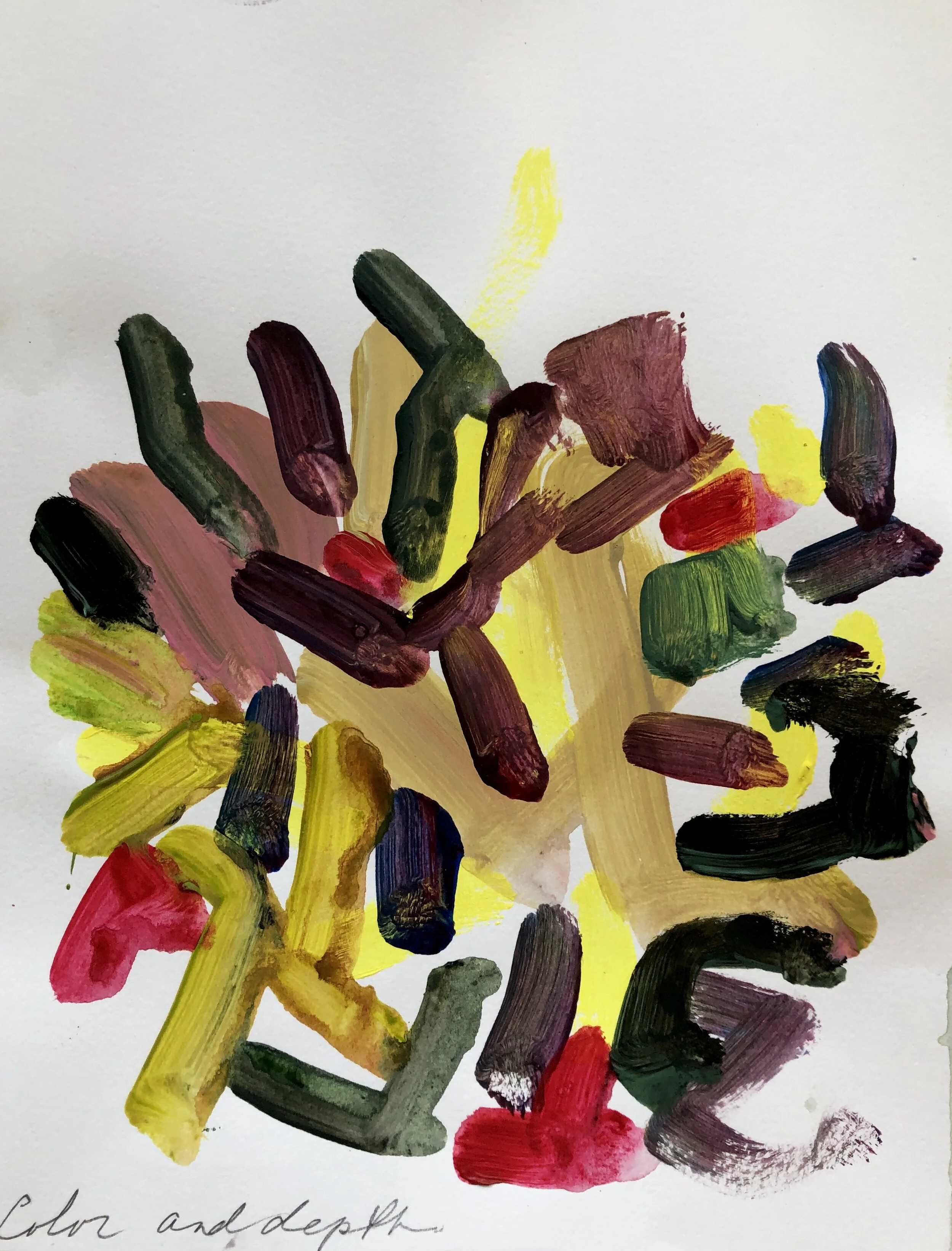
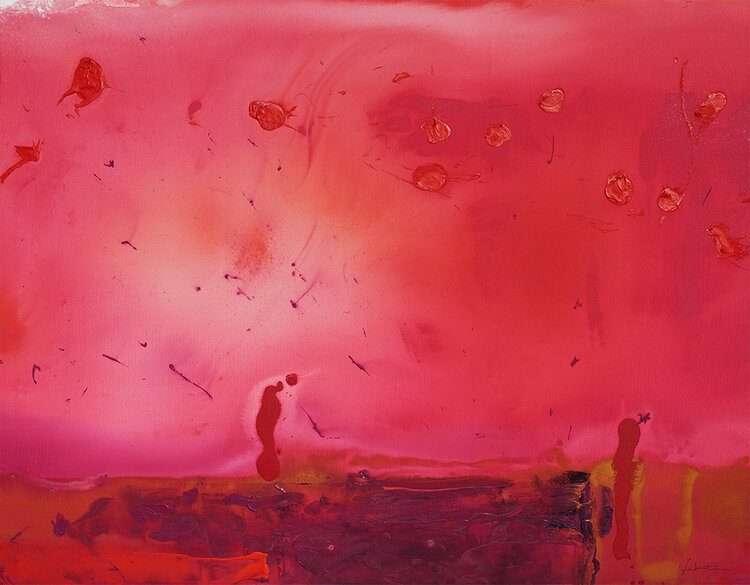
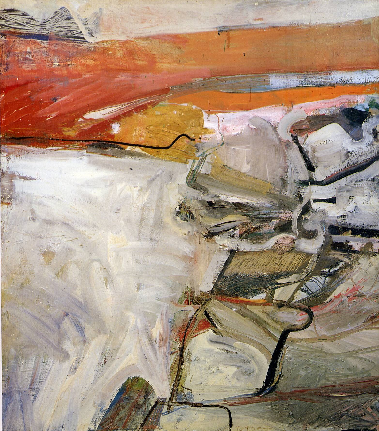
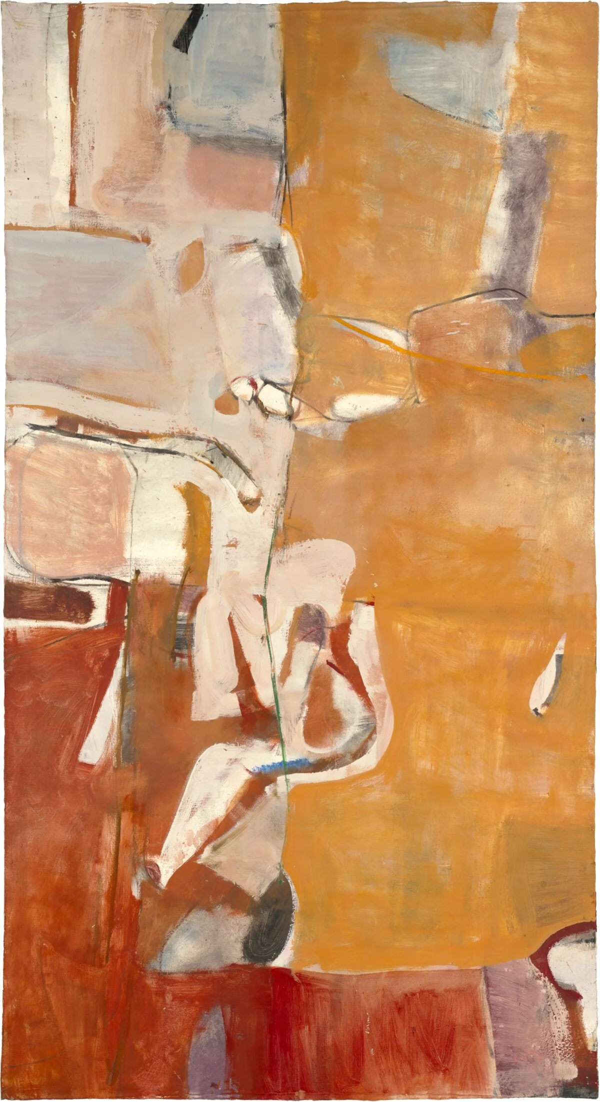
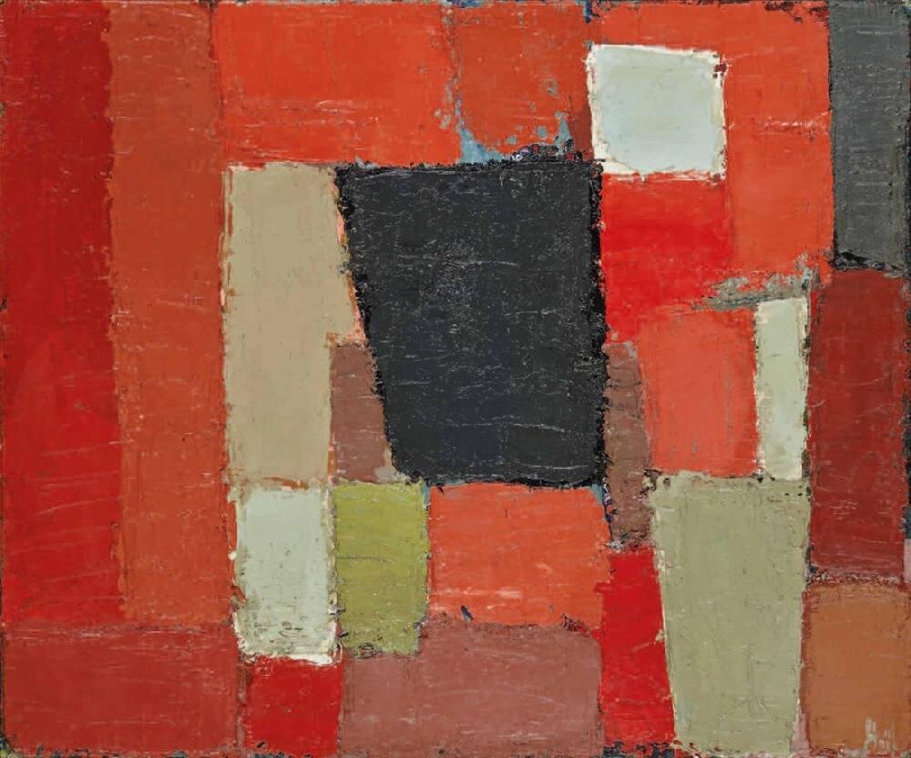
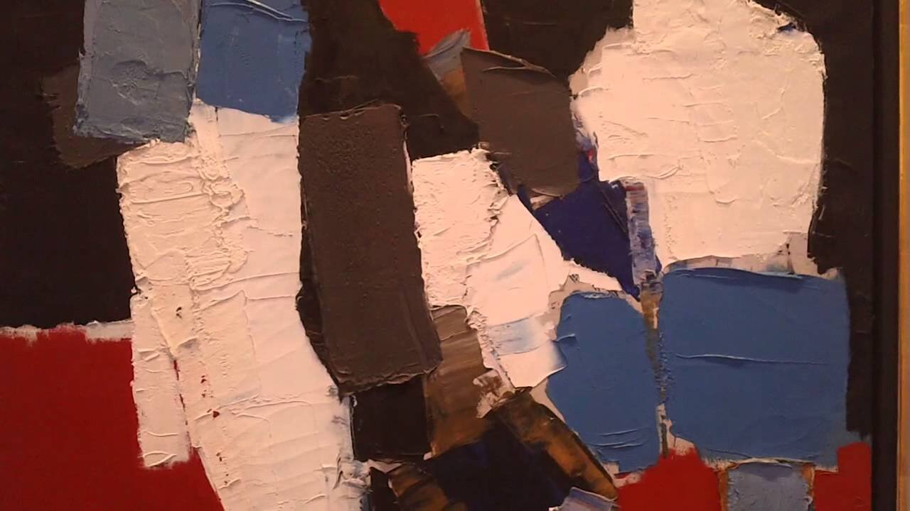
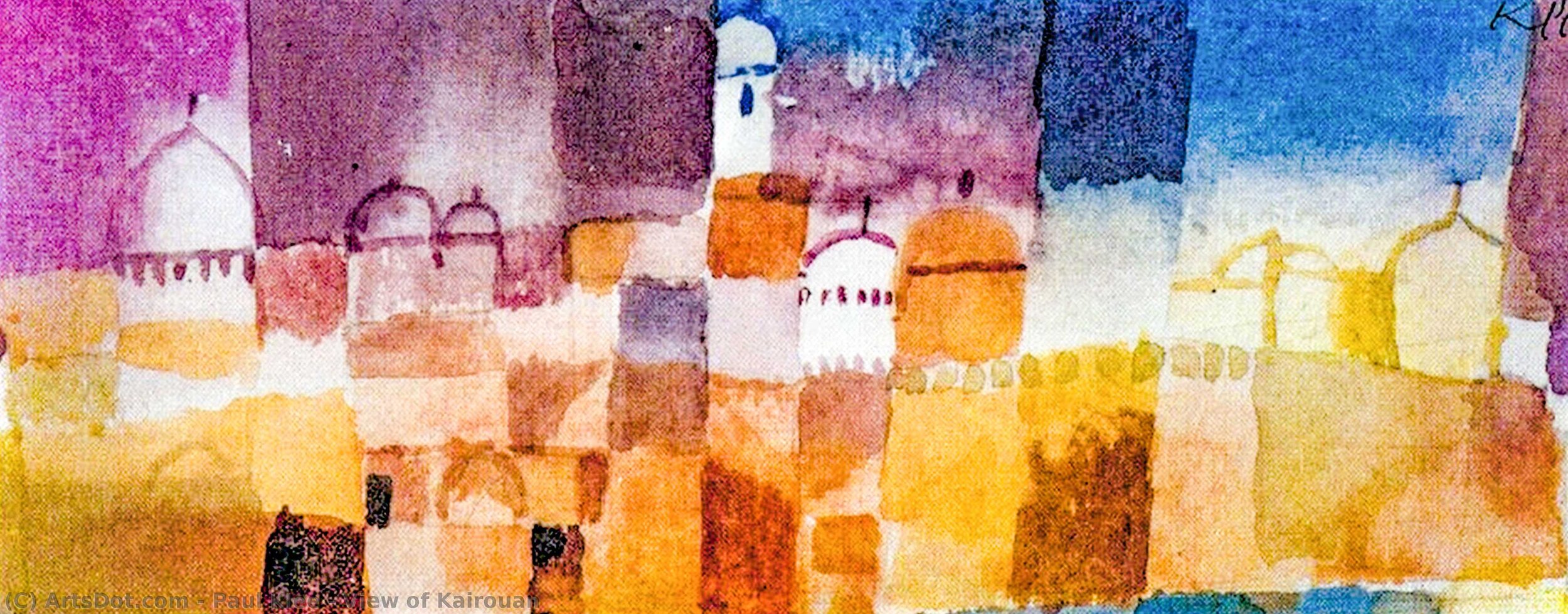
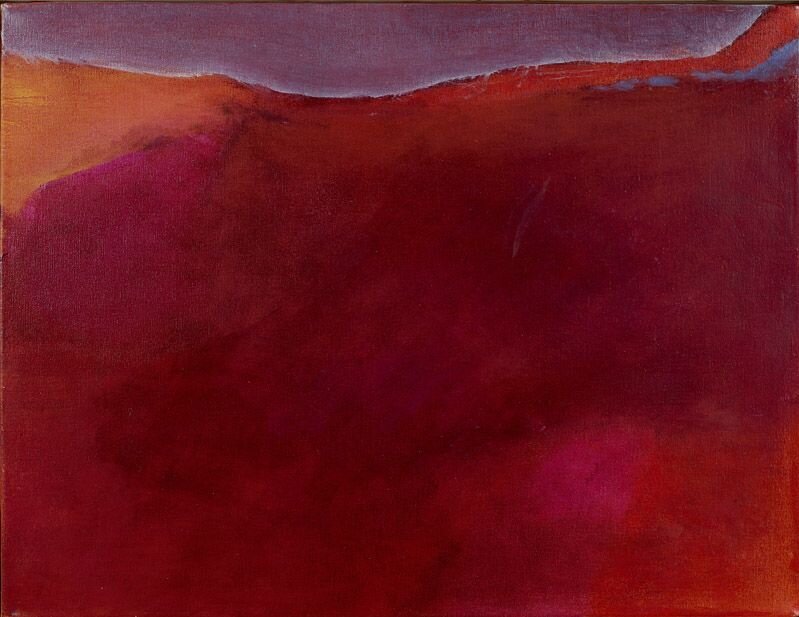
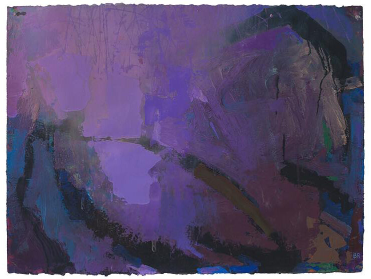
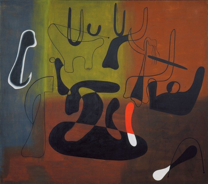
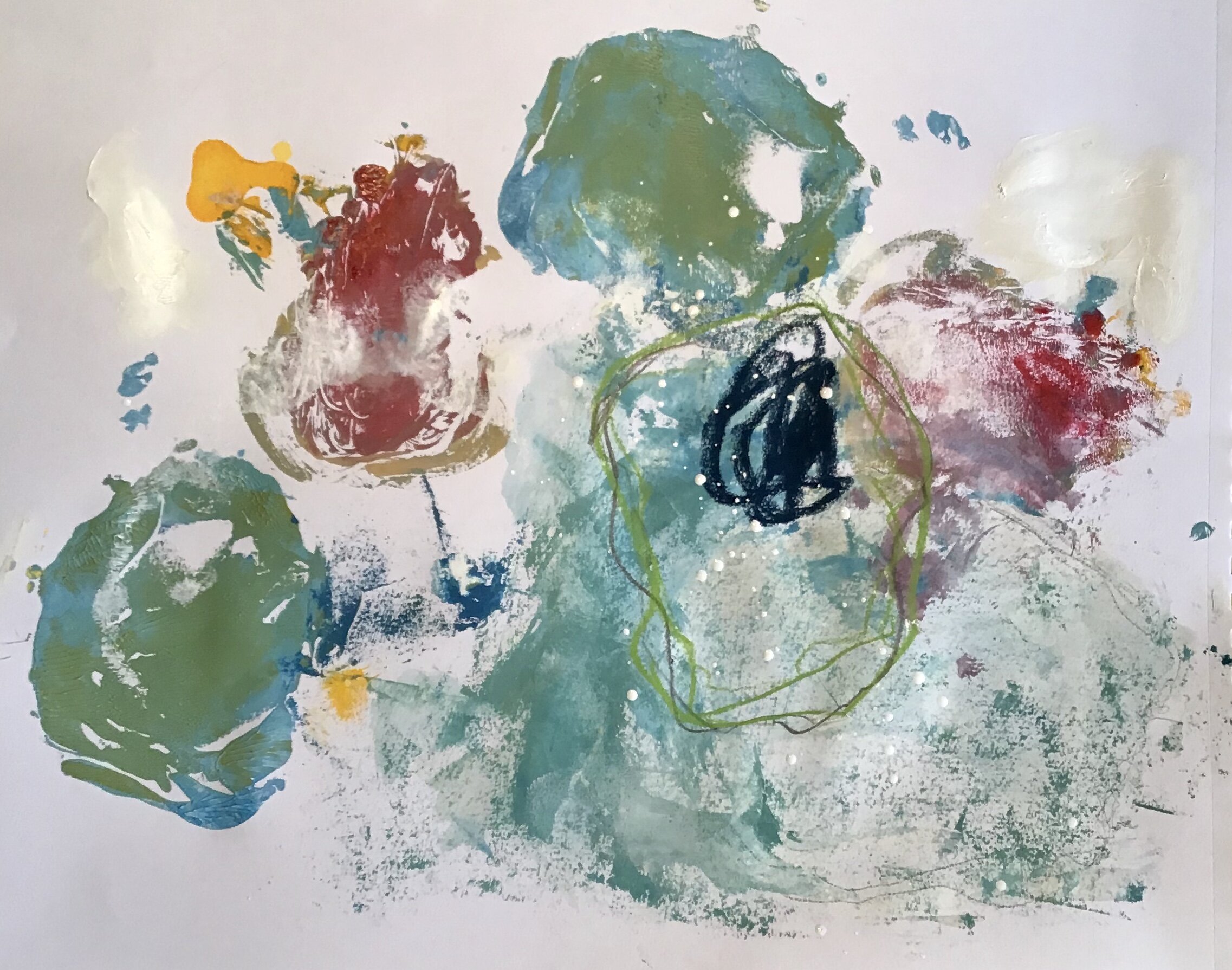
week #4 - June 30 - Developing a Personal Palette
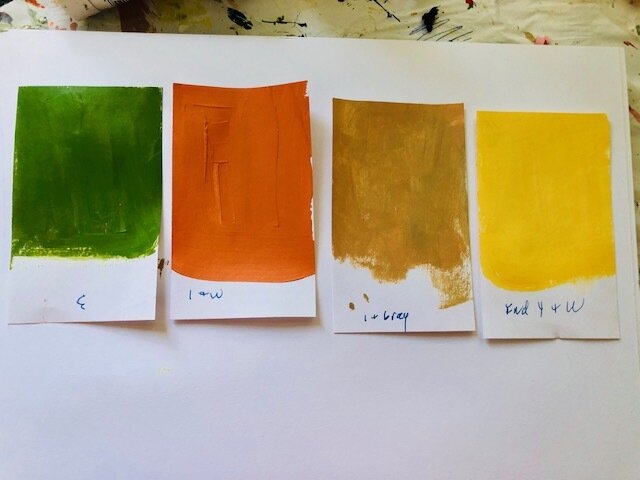
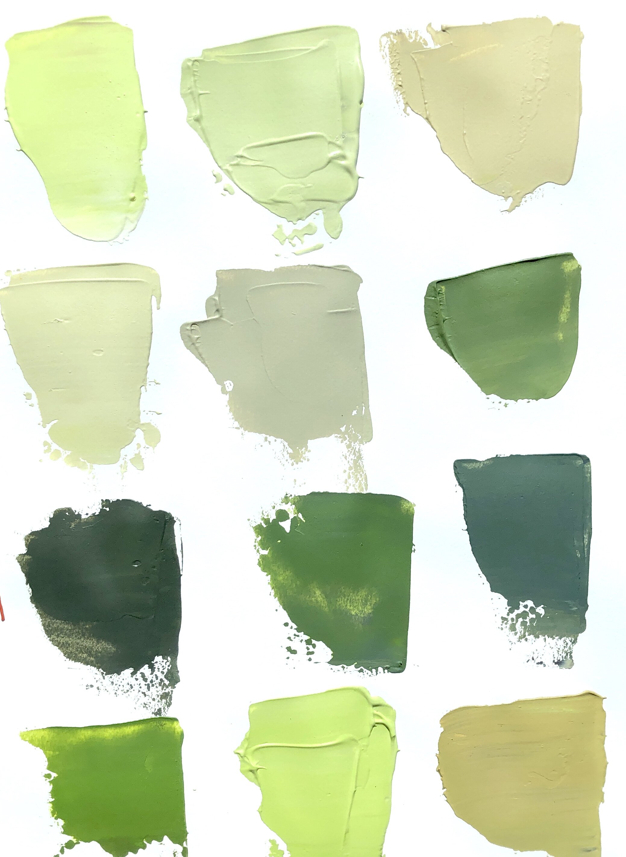
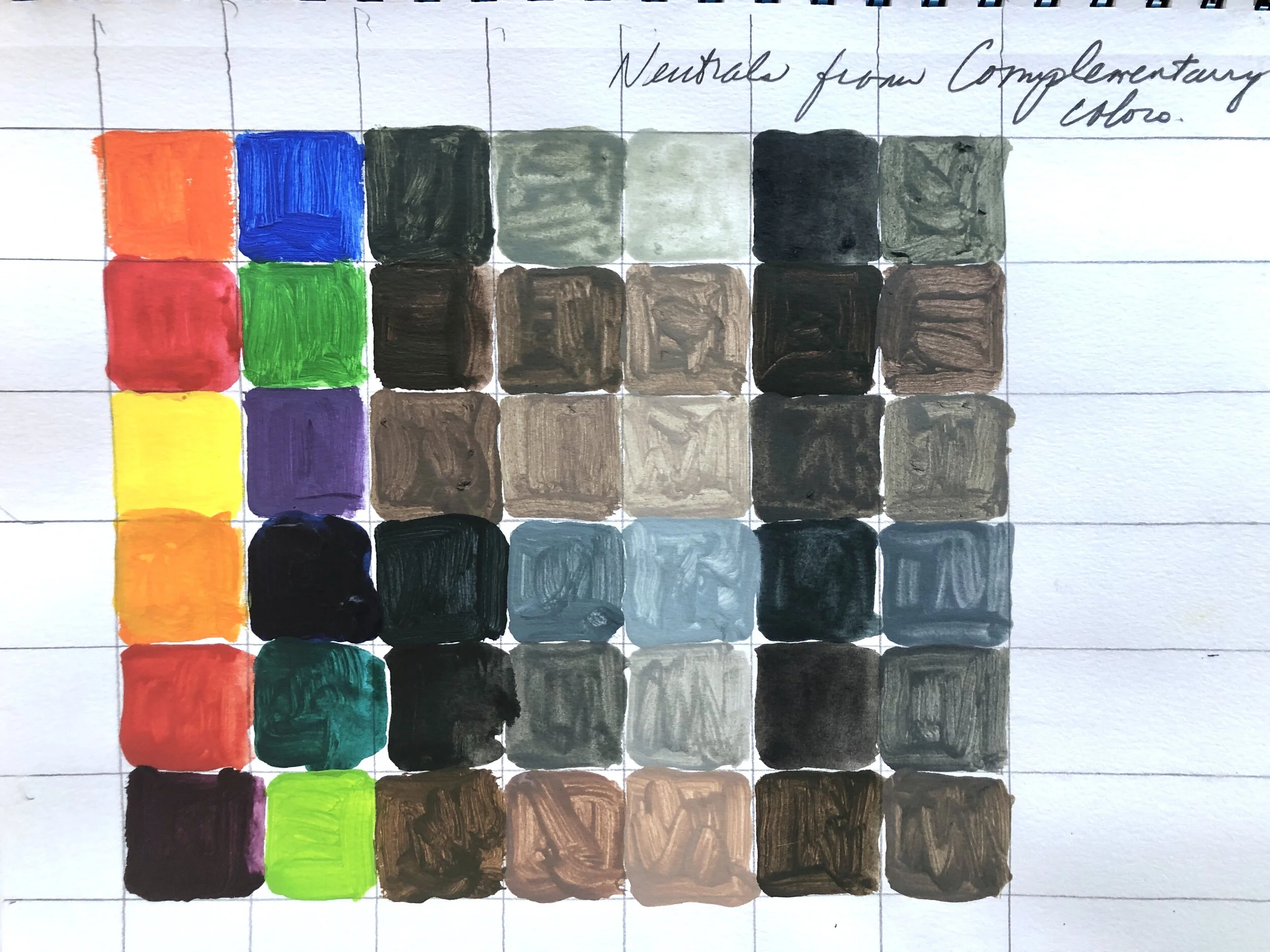
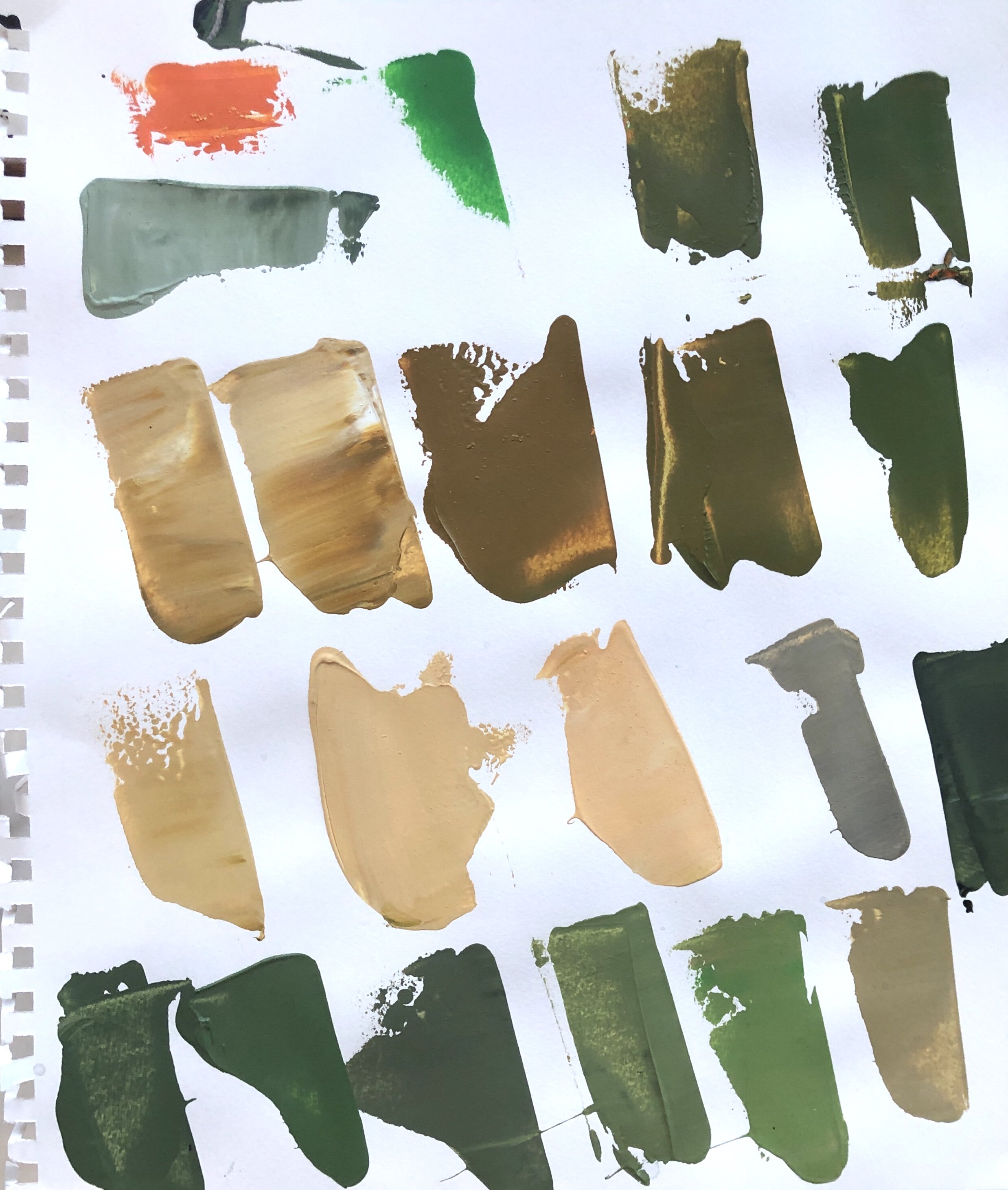
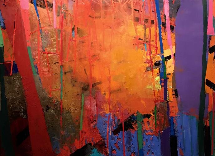
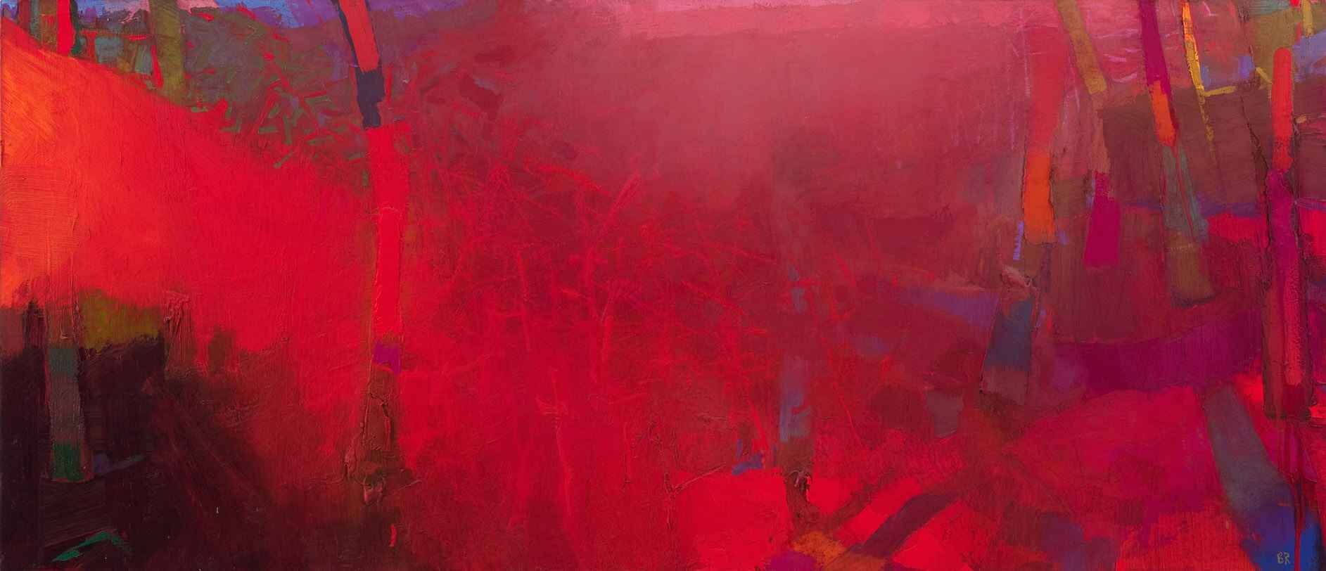
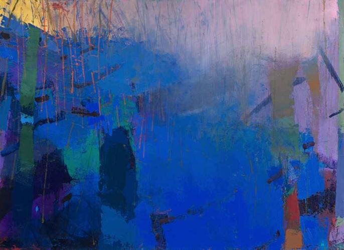
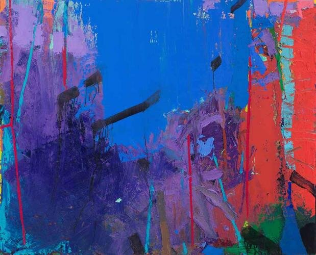
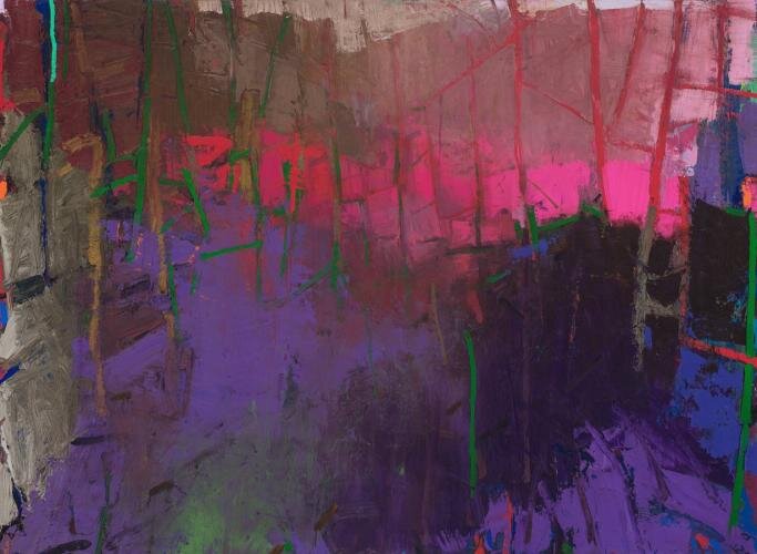
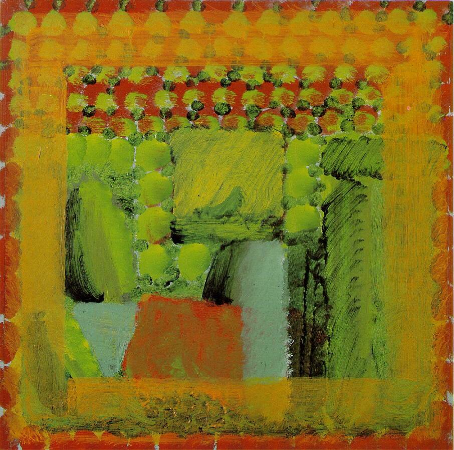
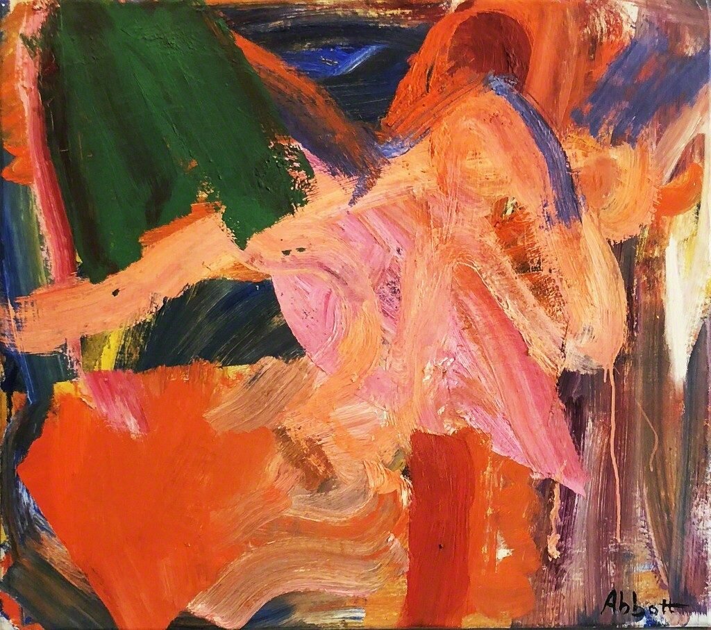
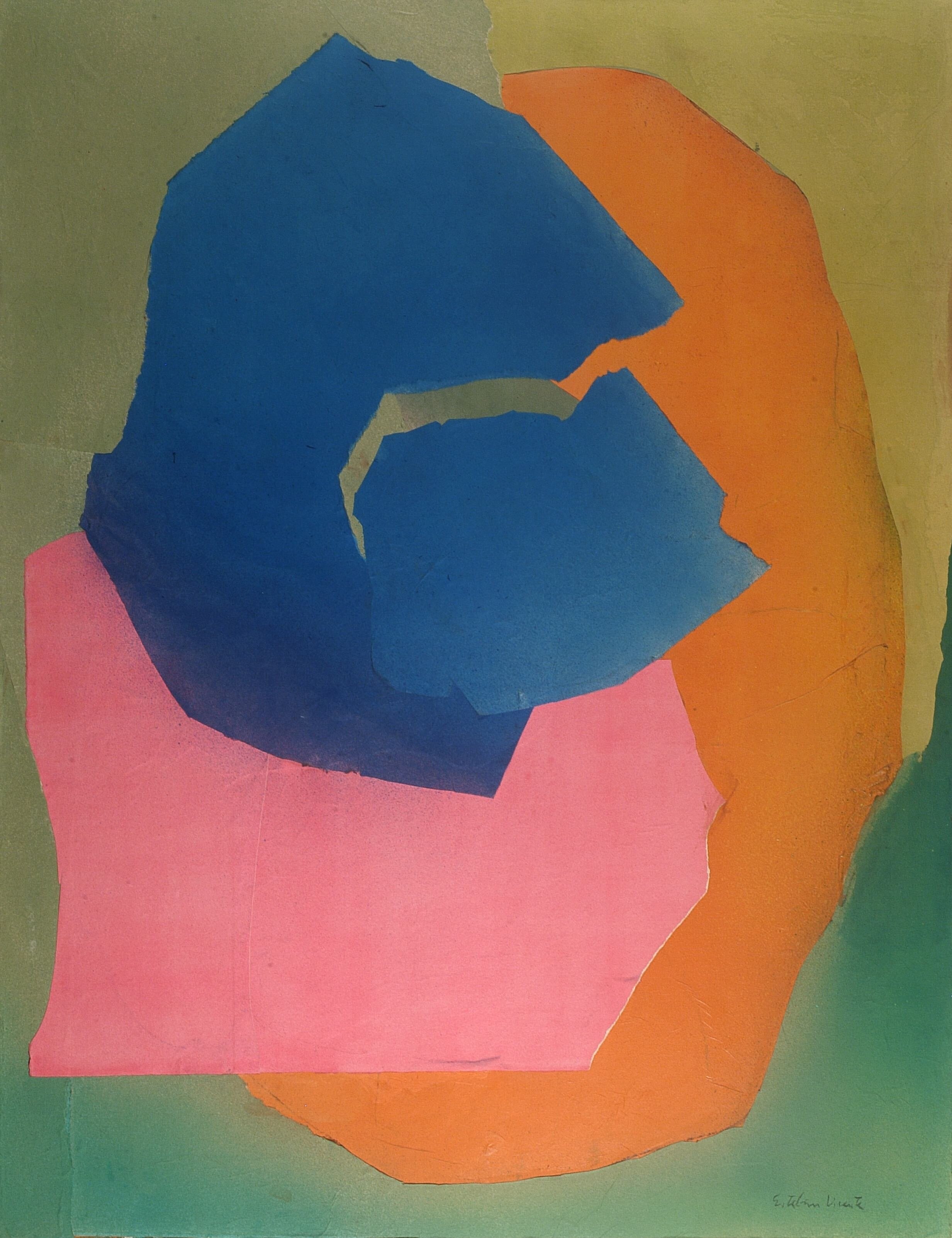
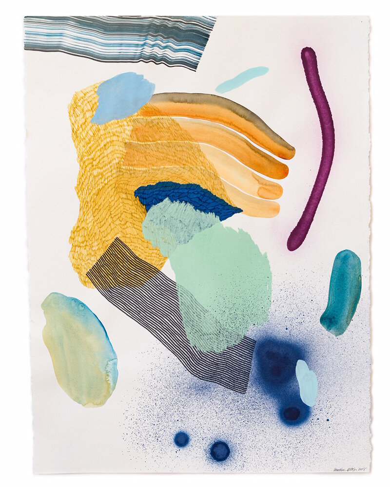
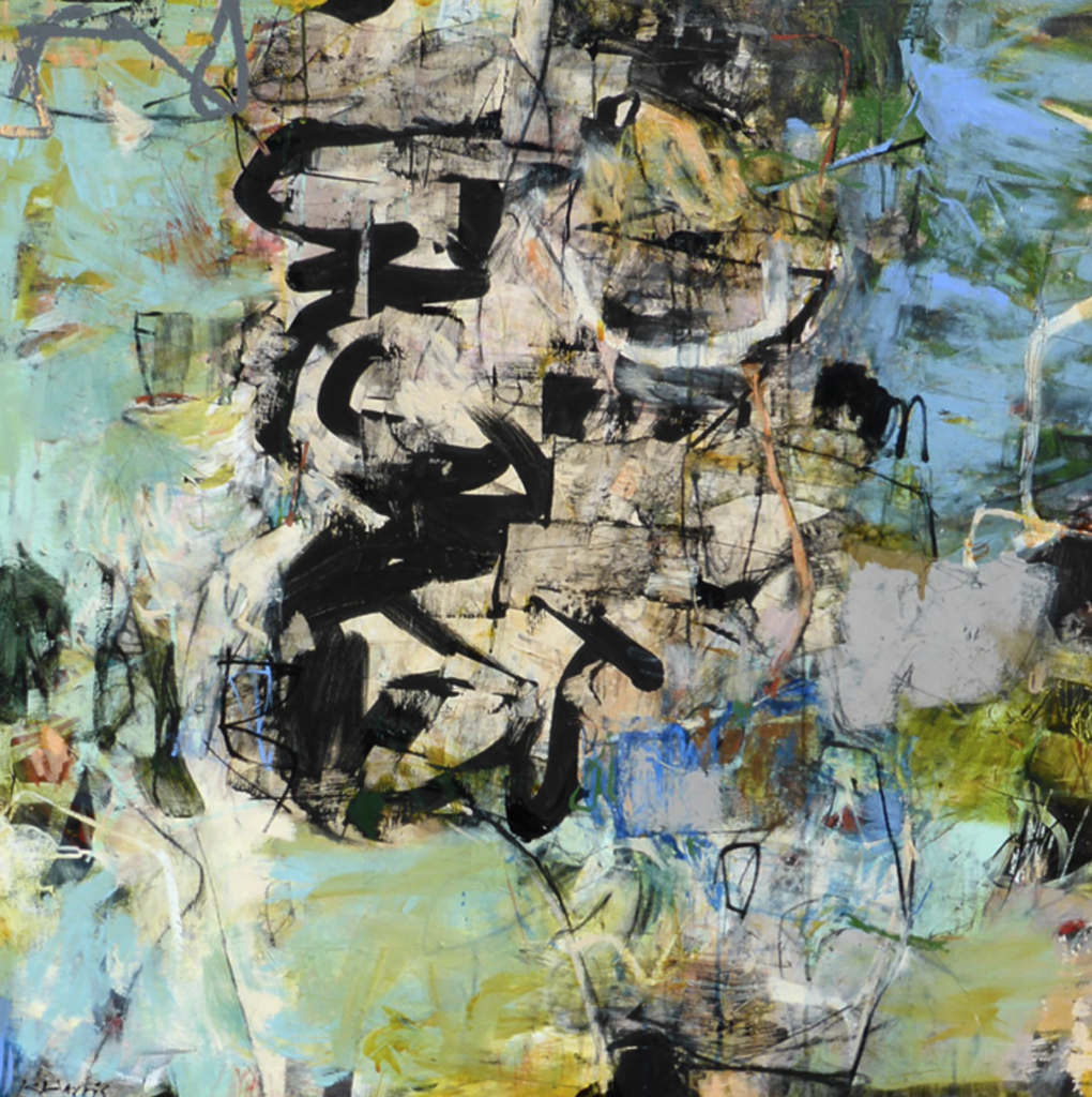
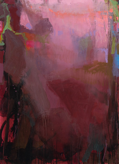
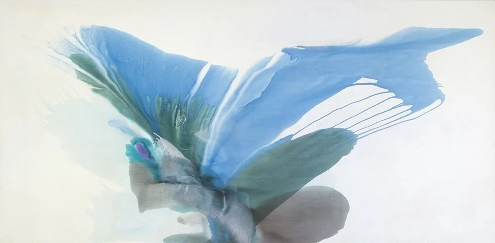
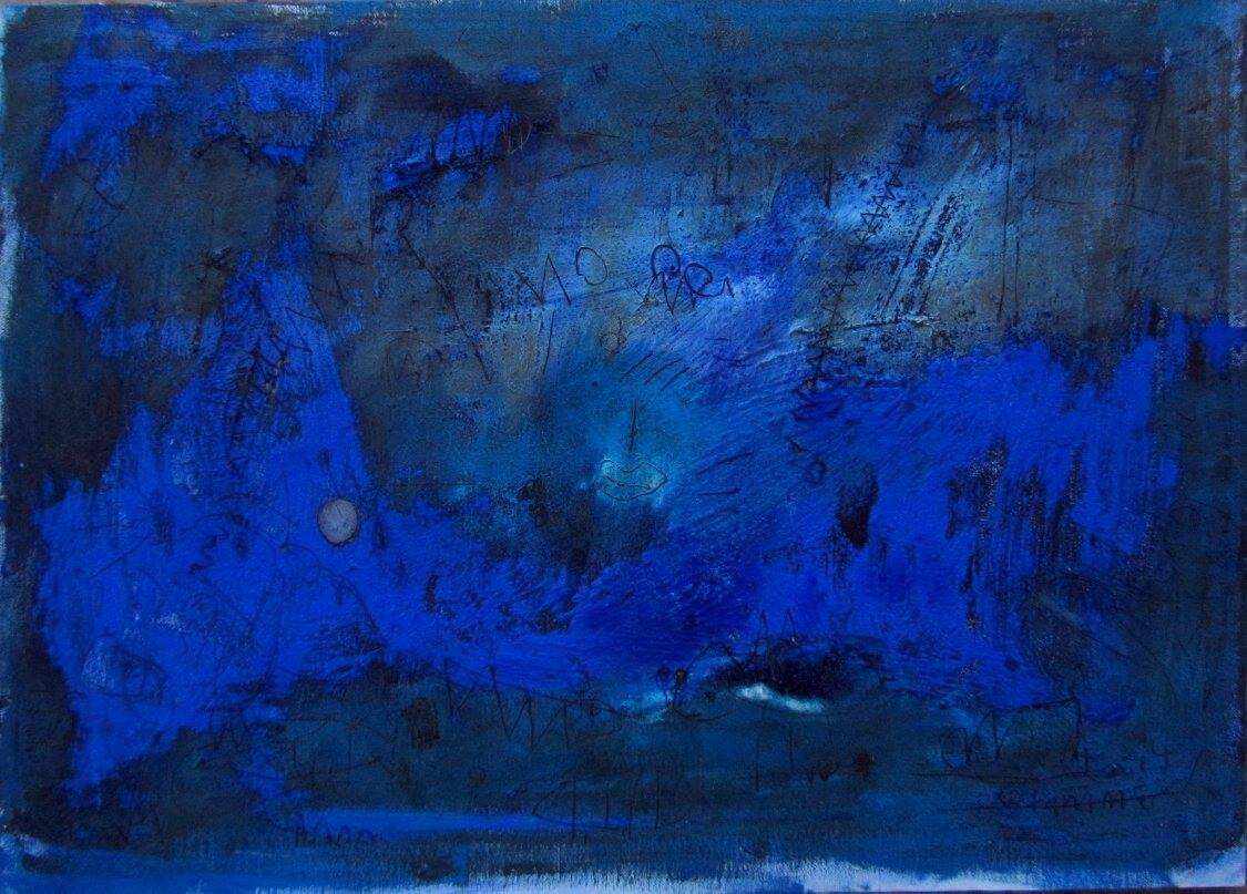
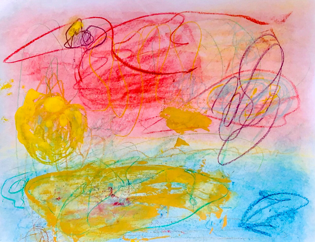
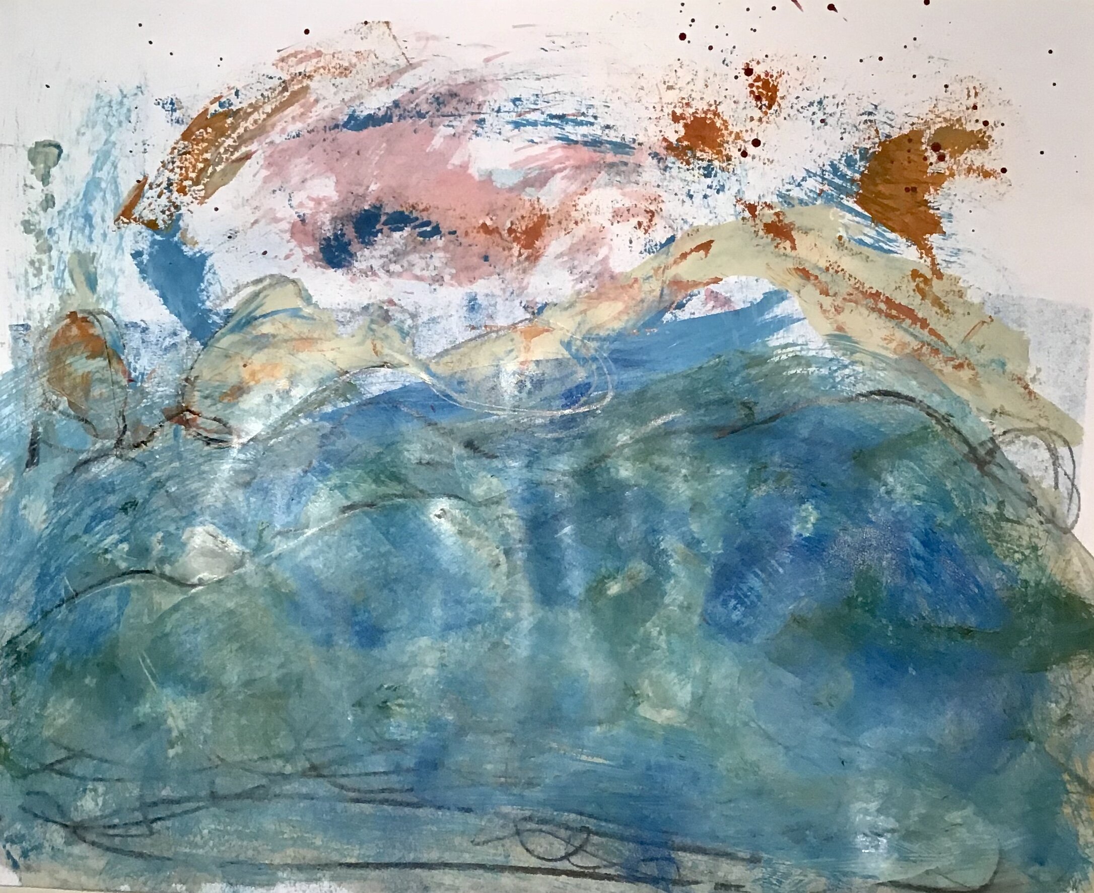
The Assignment: Choose 3 hues as the basis of your personal palette. Make lots of intuitive mixtures of your colors plus black and white to get lots of neutrals and harmonies. From all of these mixtures, choose 3 to 5 colors that look great together. You may find many combinations of 3 to 5 colors. These are like “chords” in music, harmonious notes/hues that go together. Once you have chosen chords, see which chord you like best and want to make paintings with. This chord and your original 3 hues make up your palette. Make up a sizable quantity of each of these colors and store them in 4 oz plastic containers with lids. Have these ready for class on July 7.
As a way to become familiar and connected with your palette, you might want to do the following write-up in your workbook.
Why did you choose the original 3 hues? And, the chord?
What kind of energy does this palette exhibit to you?
What does your palette remind you of? Is there a memory, a feeling, a place, a season, a time of day, an experience, something in nature, etc.
Name the moods that you feel and want to create with your palette.
Name your colors, name your palette
Add some accent colors other than the saturated hues you started with. You might also want to add colors of Woody’s or chalk pastels that would be good accents for making marks.
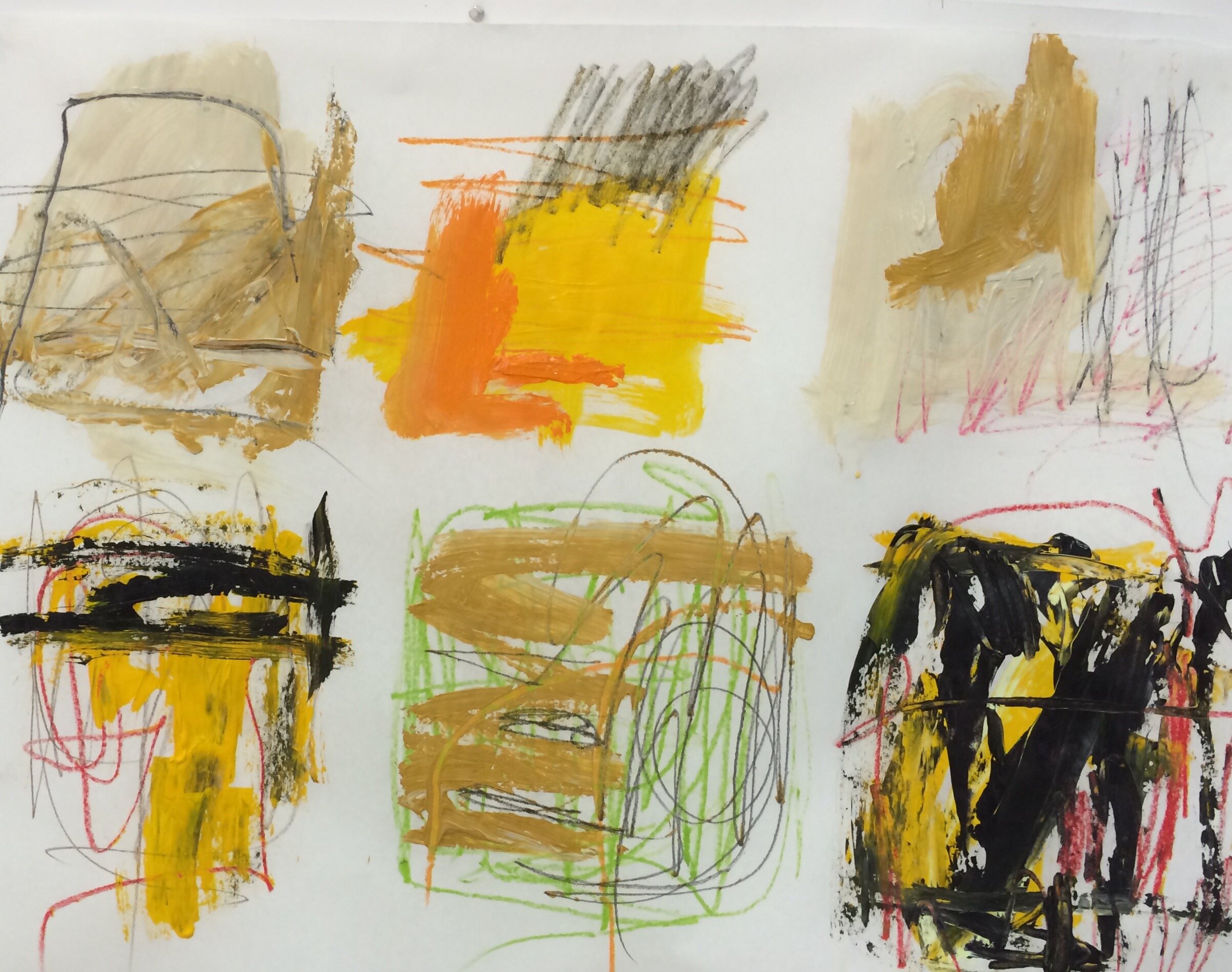
Begin to do studies or paintings with your palette.
June 30, 2020 Class Video
WEEK 5 - july 7 - WORKING WITH YOUR PERSONAL PALETTE AND COLOR RHYTHM
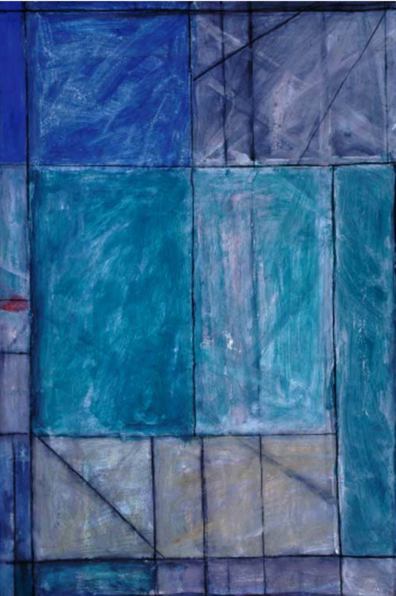
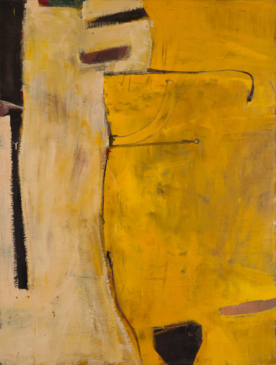
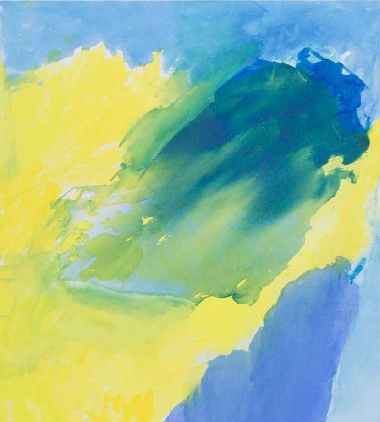
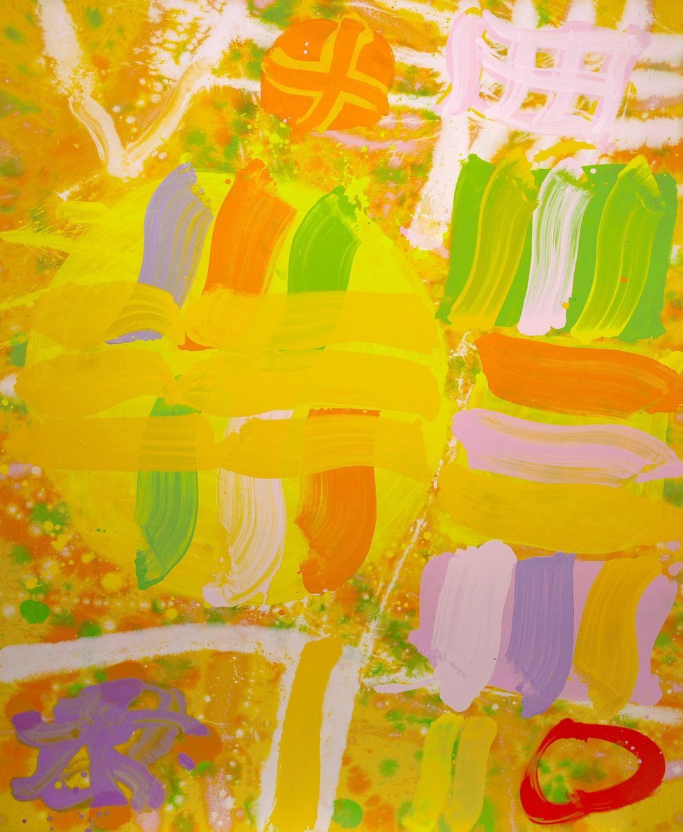
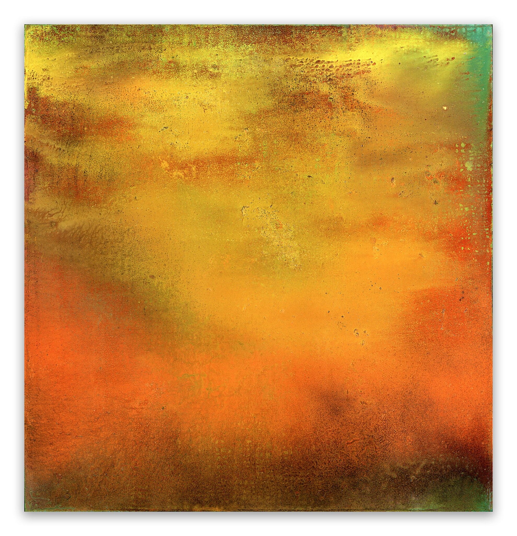
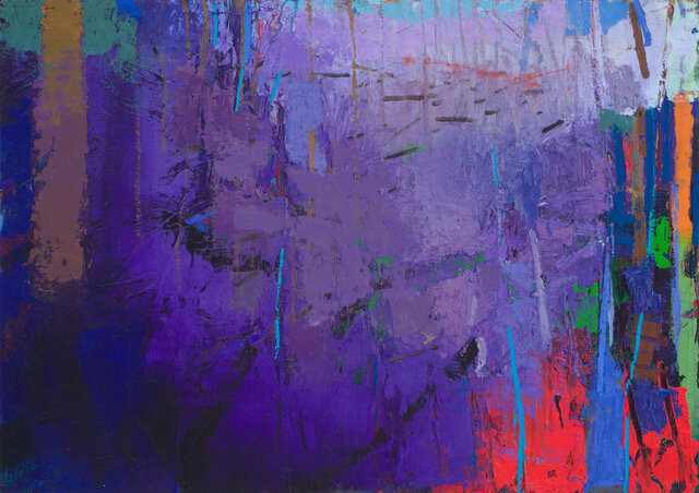
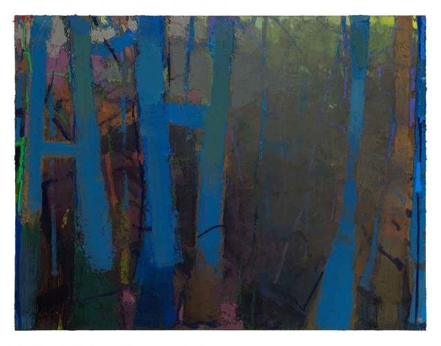
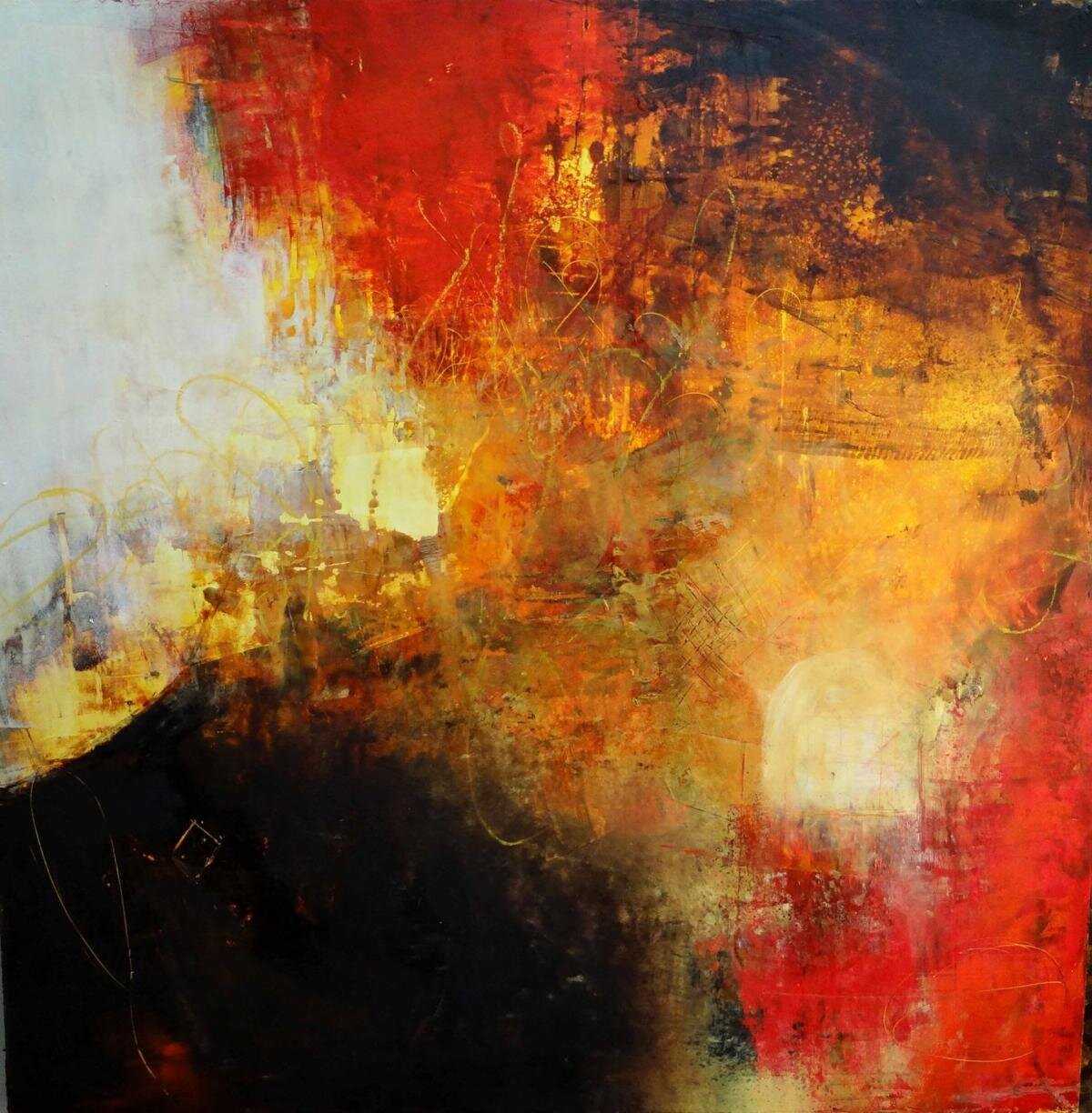
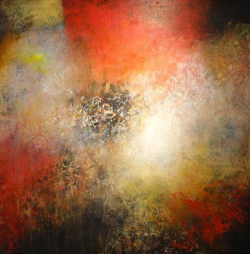
week #6 - Tone, Mood and Atmosphere of Color
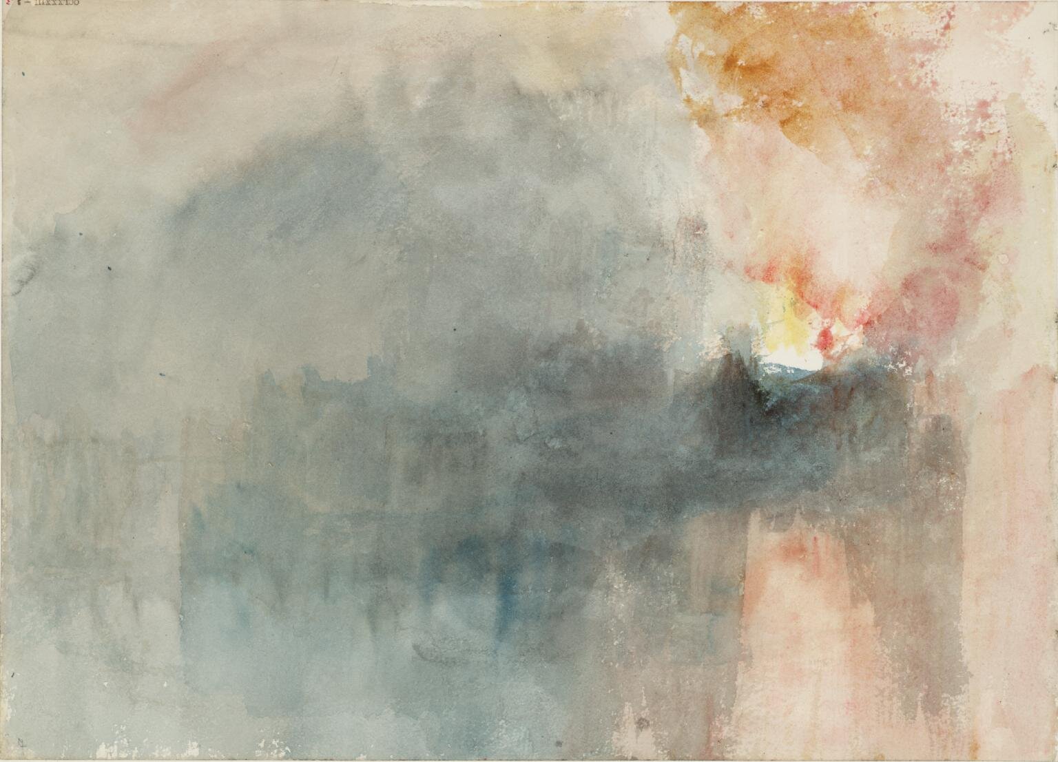
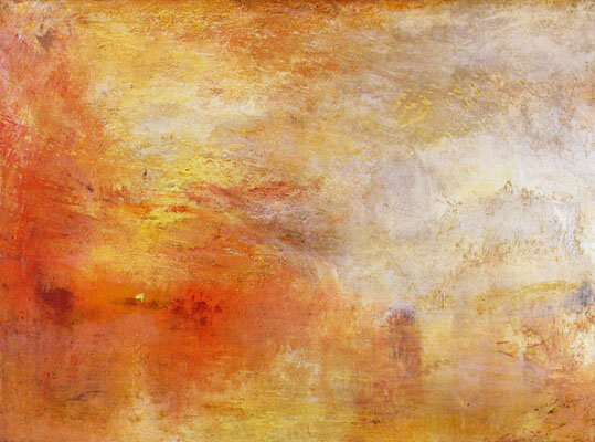
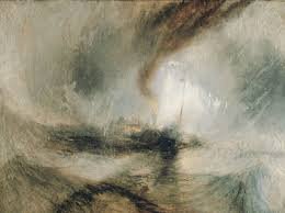
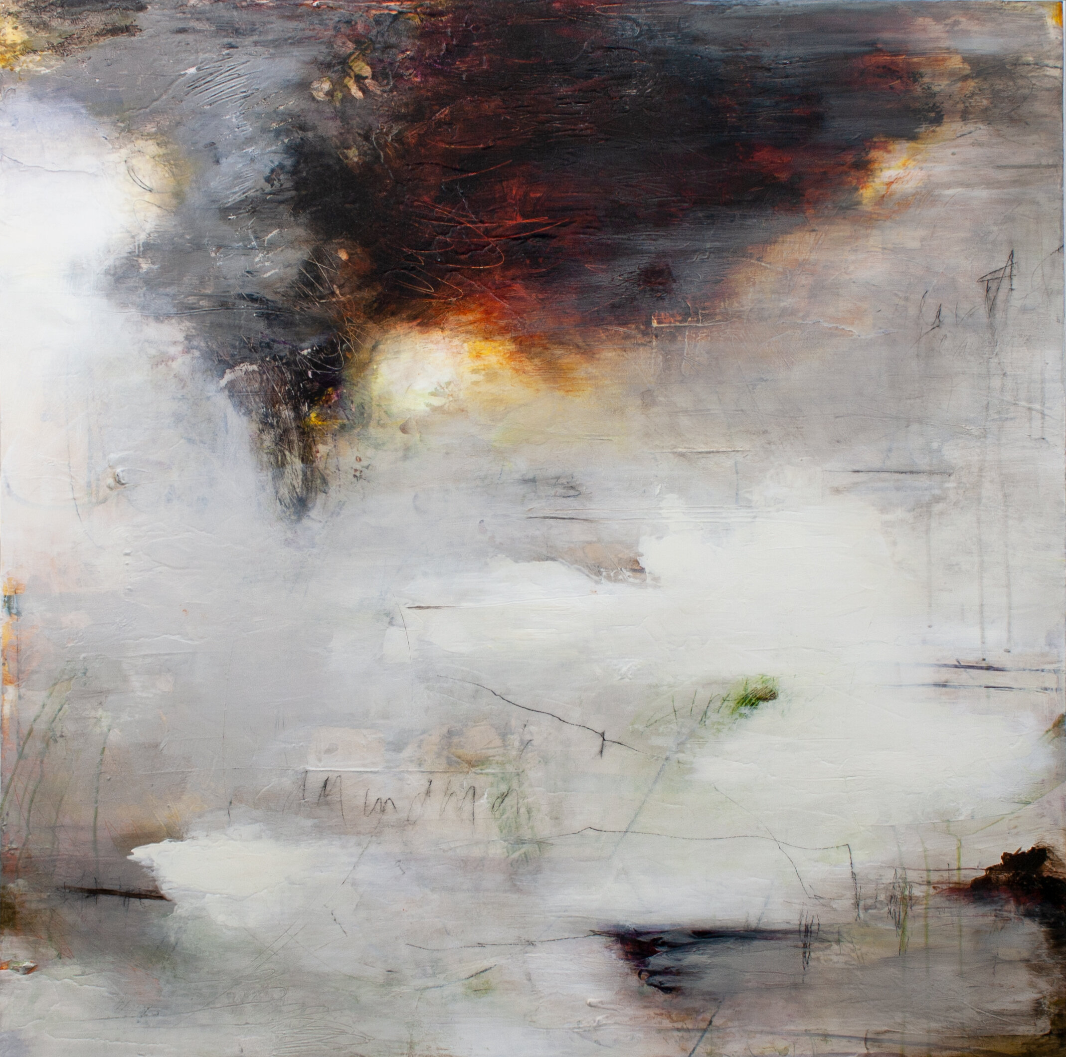
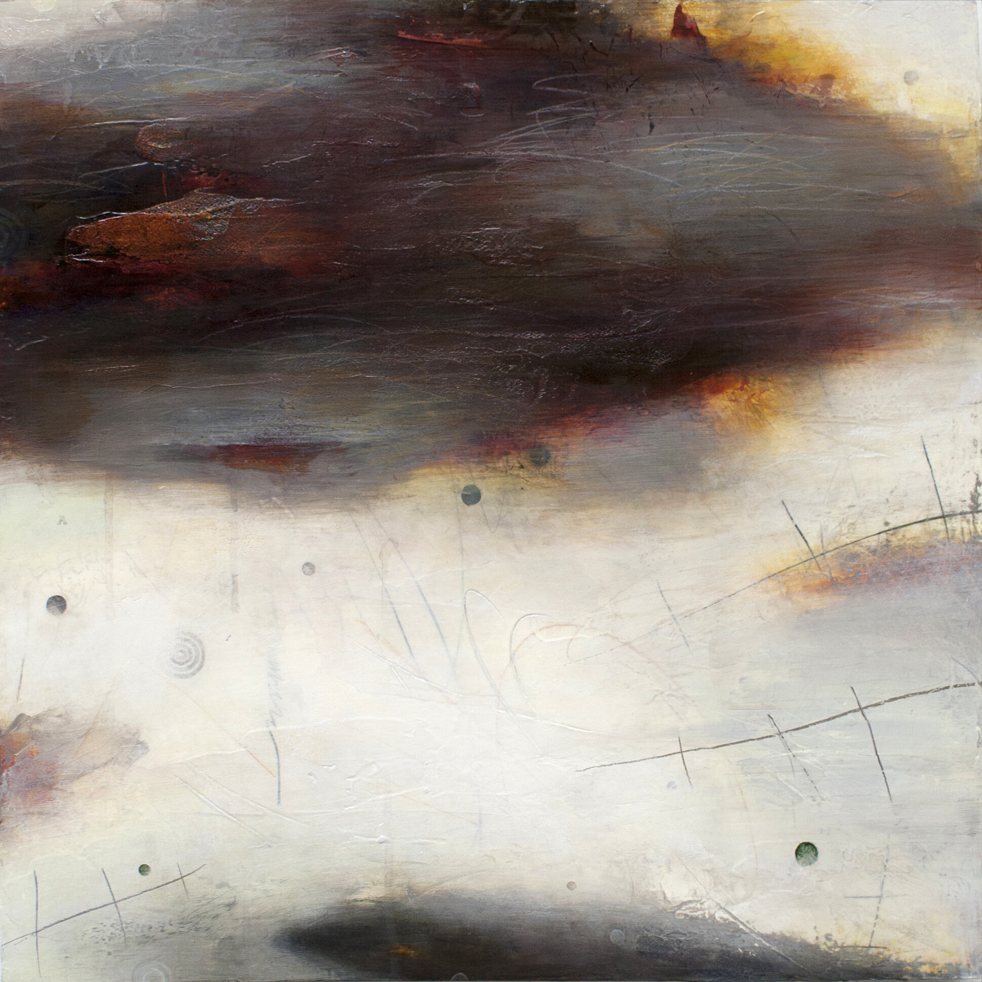
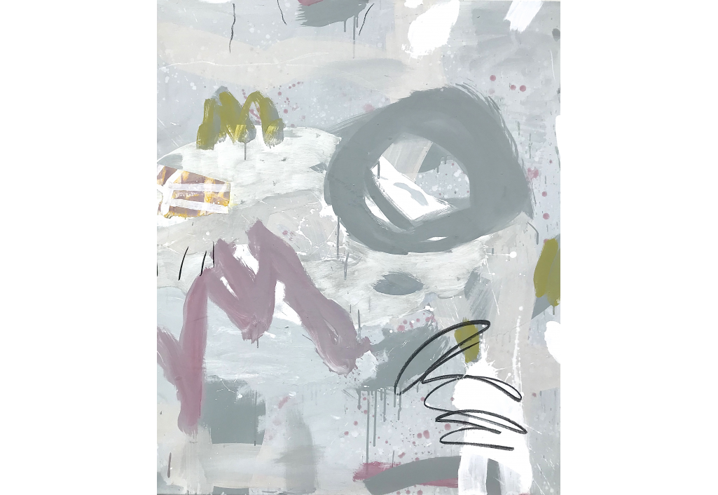
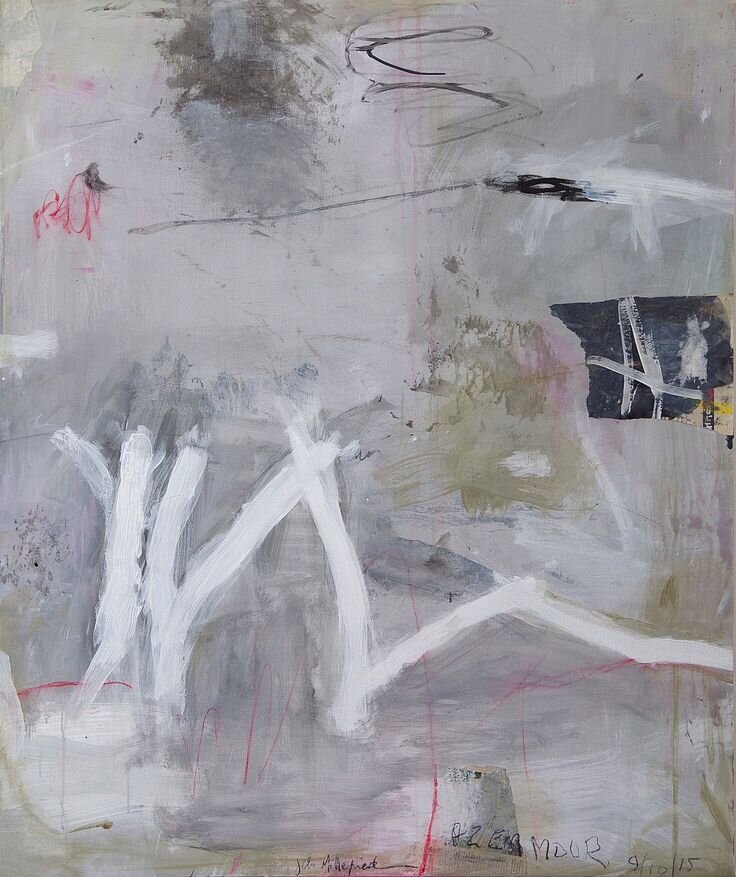
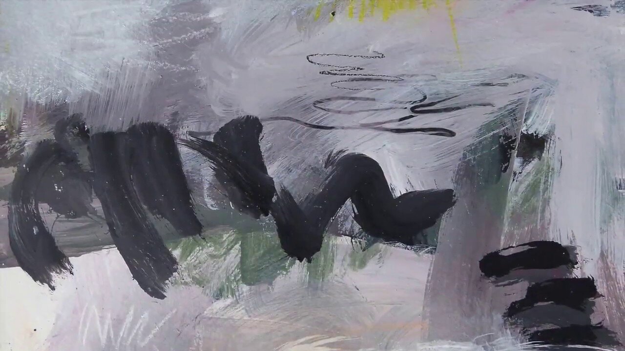
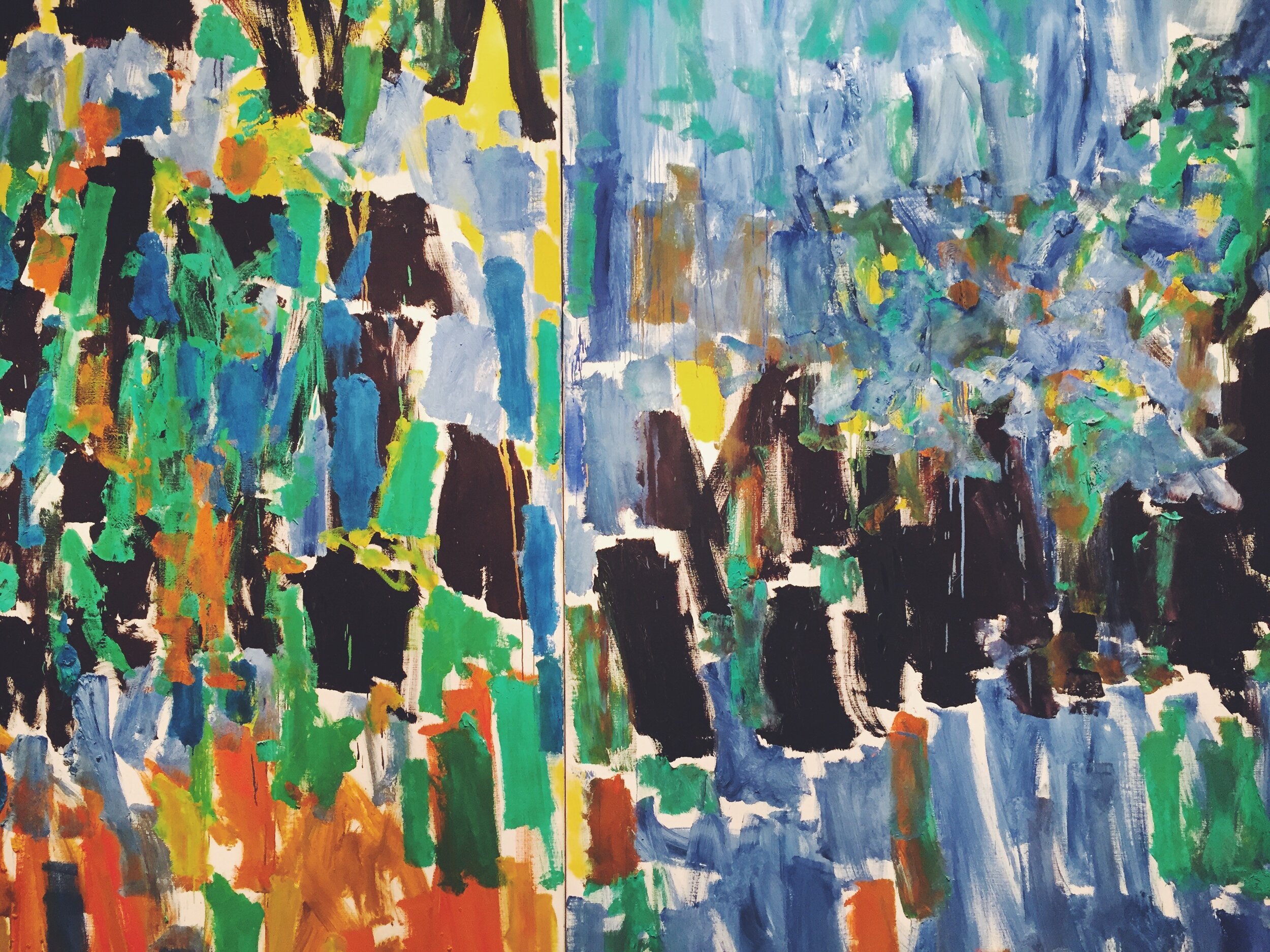
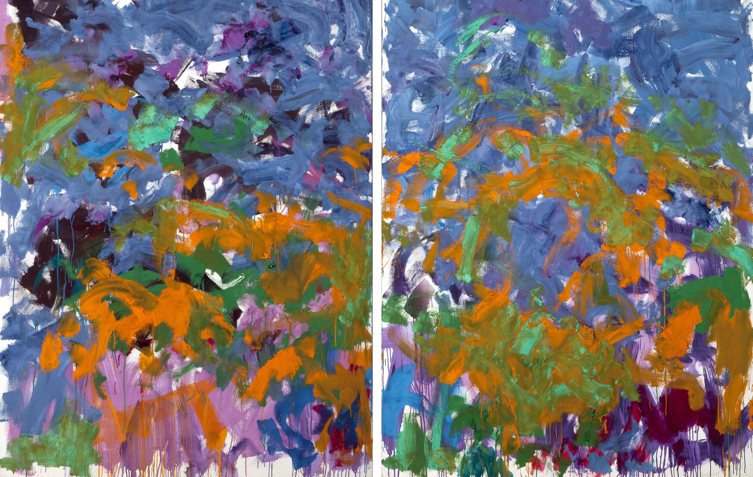
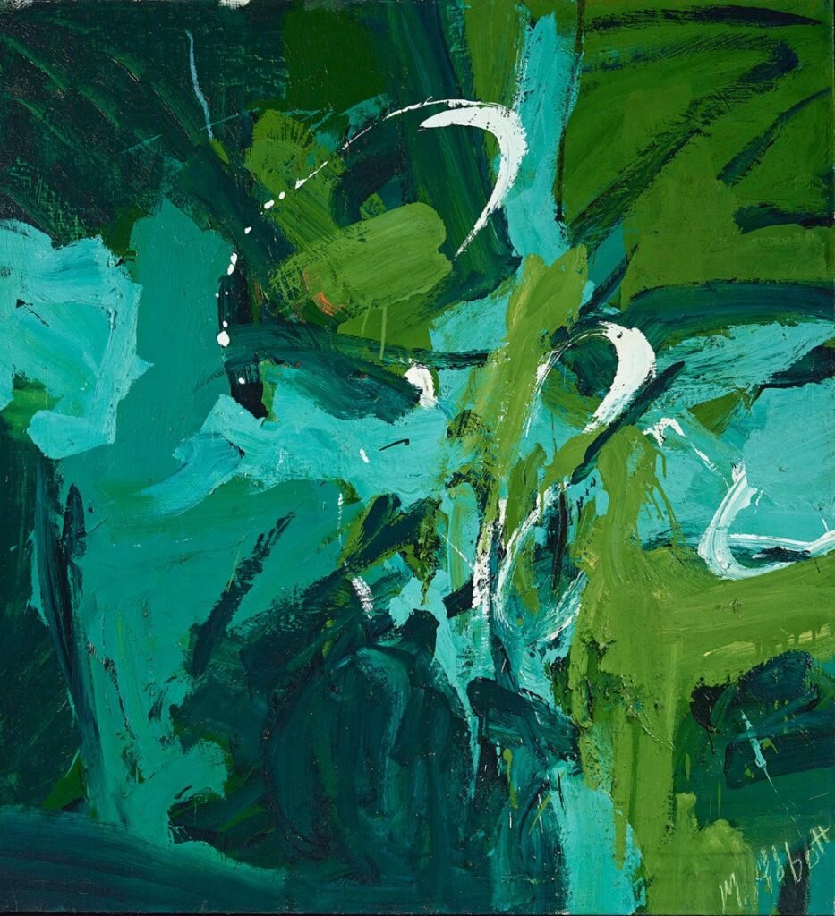
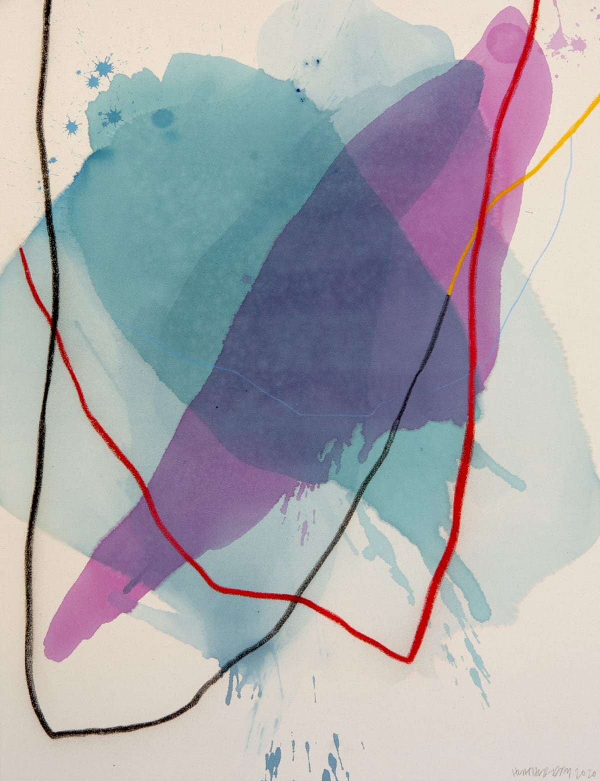
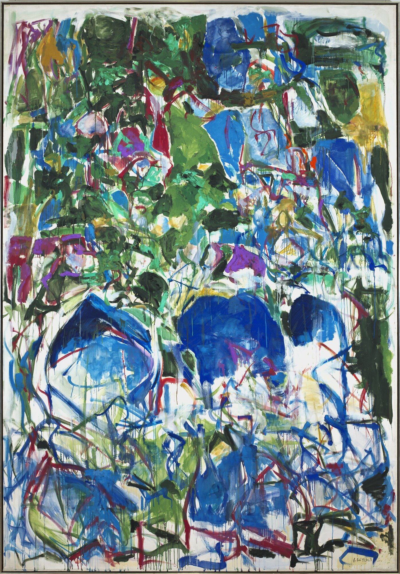
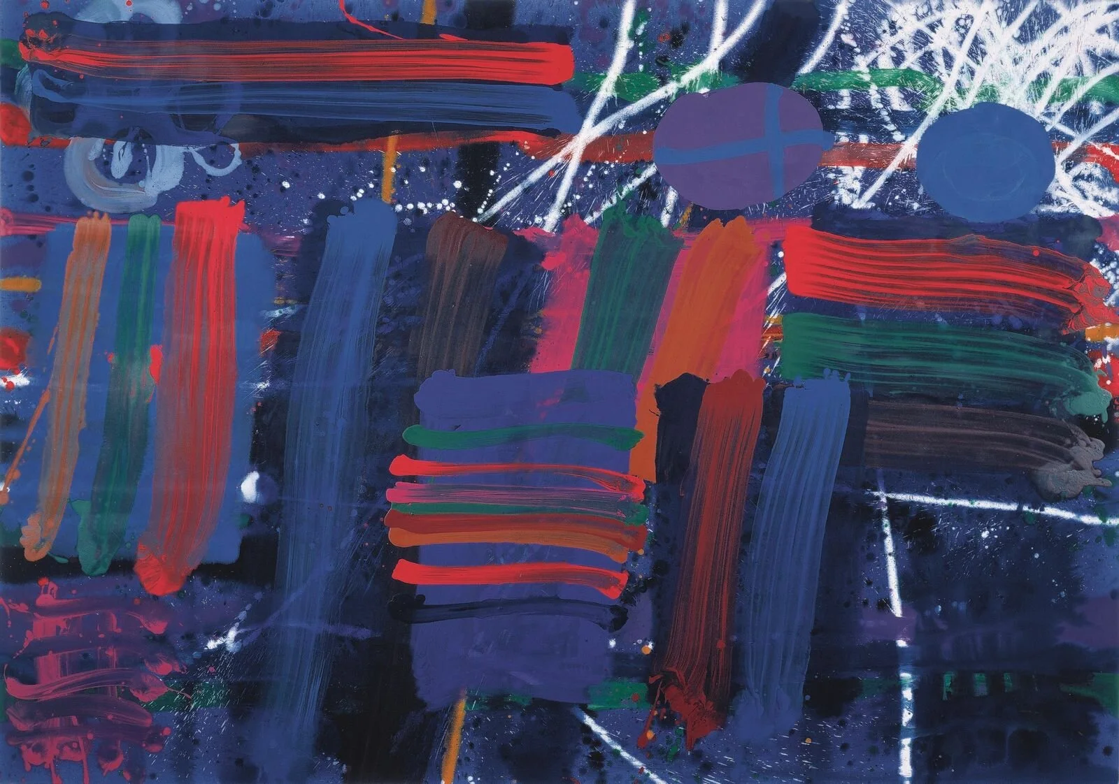
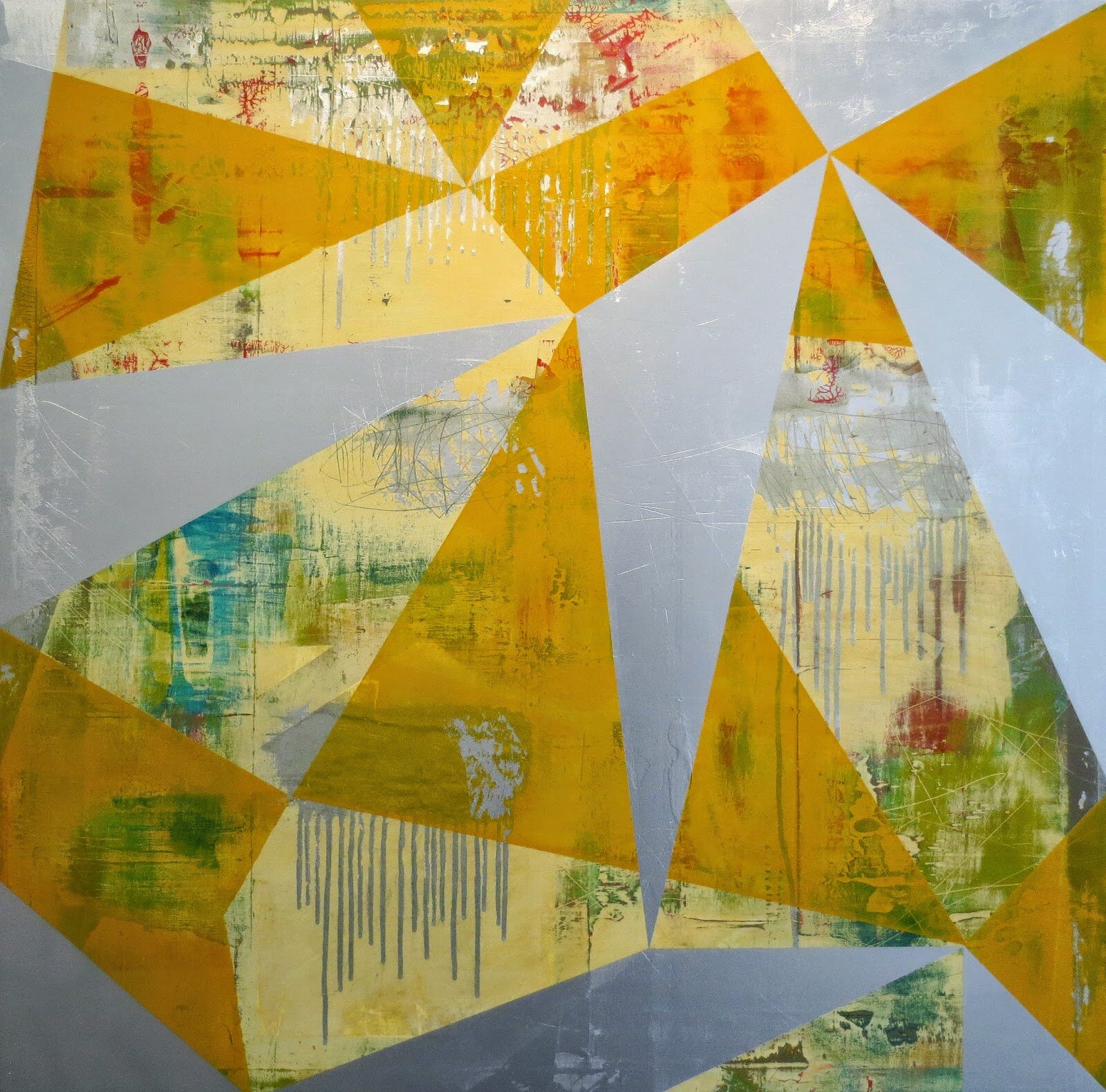
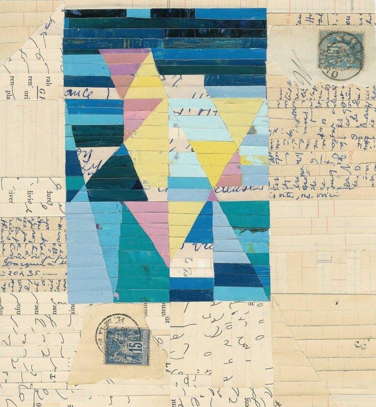
5 different COLOR RHYTHMS
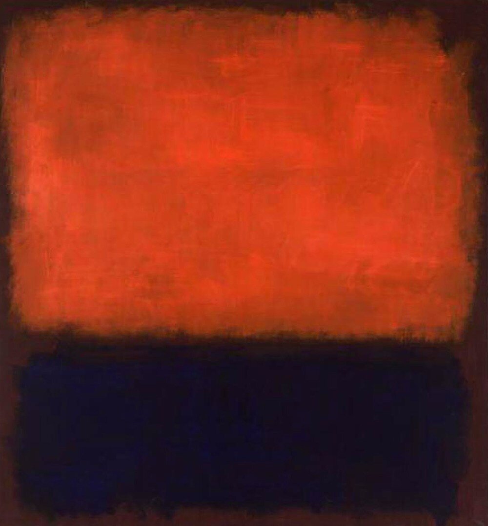
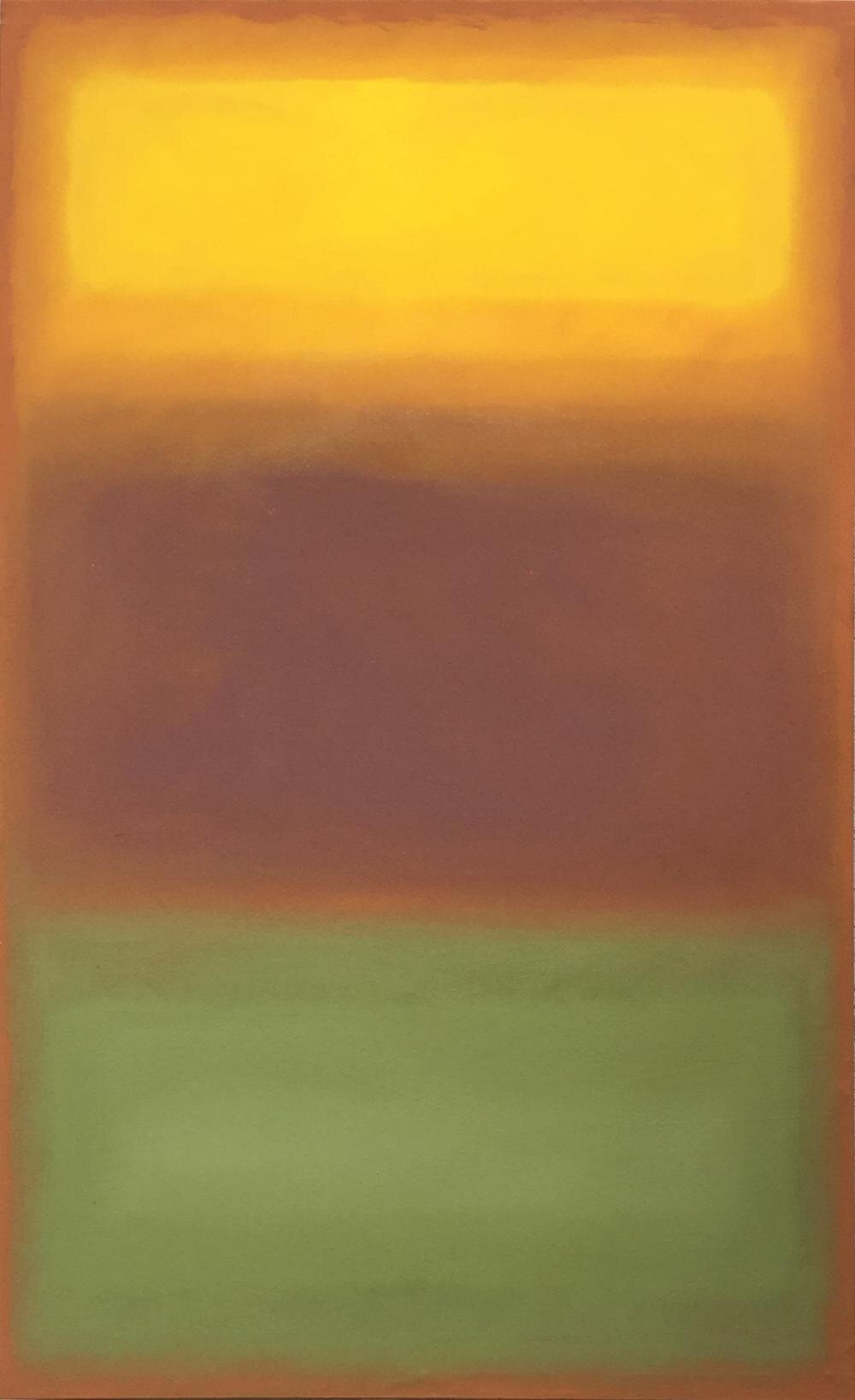
1. Saturation Rhythm – ie, how much hue is in the color. very saturated, somewhat saturated, little saturation. With each color, you can create variation in saturation through tints, shades and tones/neutrals
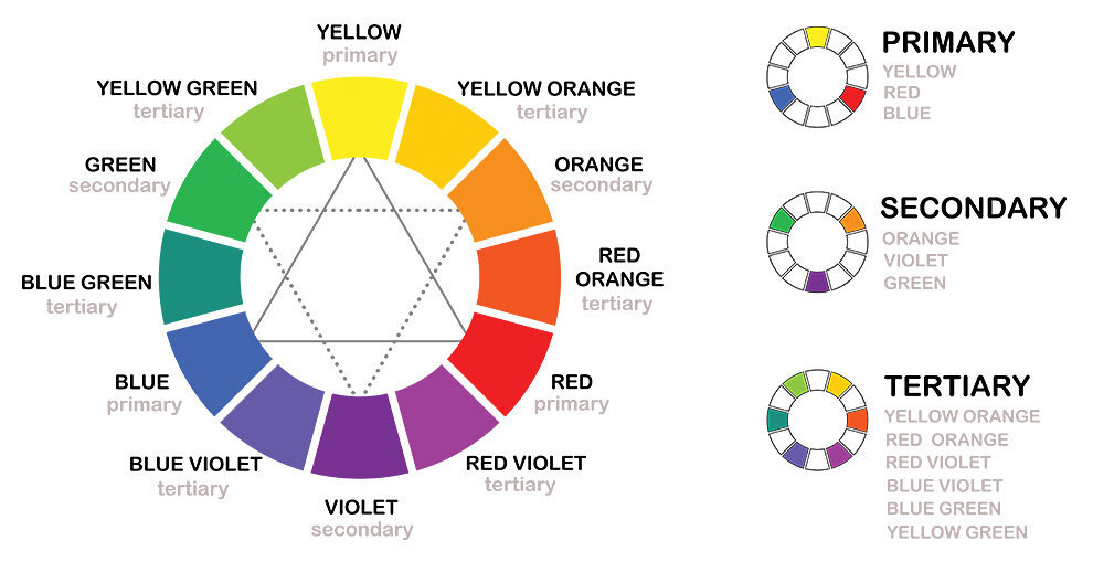
2. Hue Rhythm/Family Rhythm – various hues with a same base color, ie, hues next to each other on the color wheel. They are a family because they have the same hue in all three of the colors which ties them together to create the rhythm. Ie., yellow green and green and blue green.
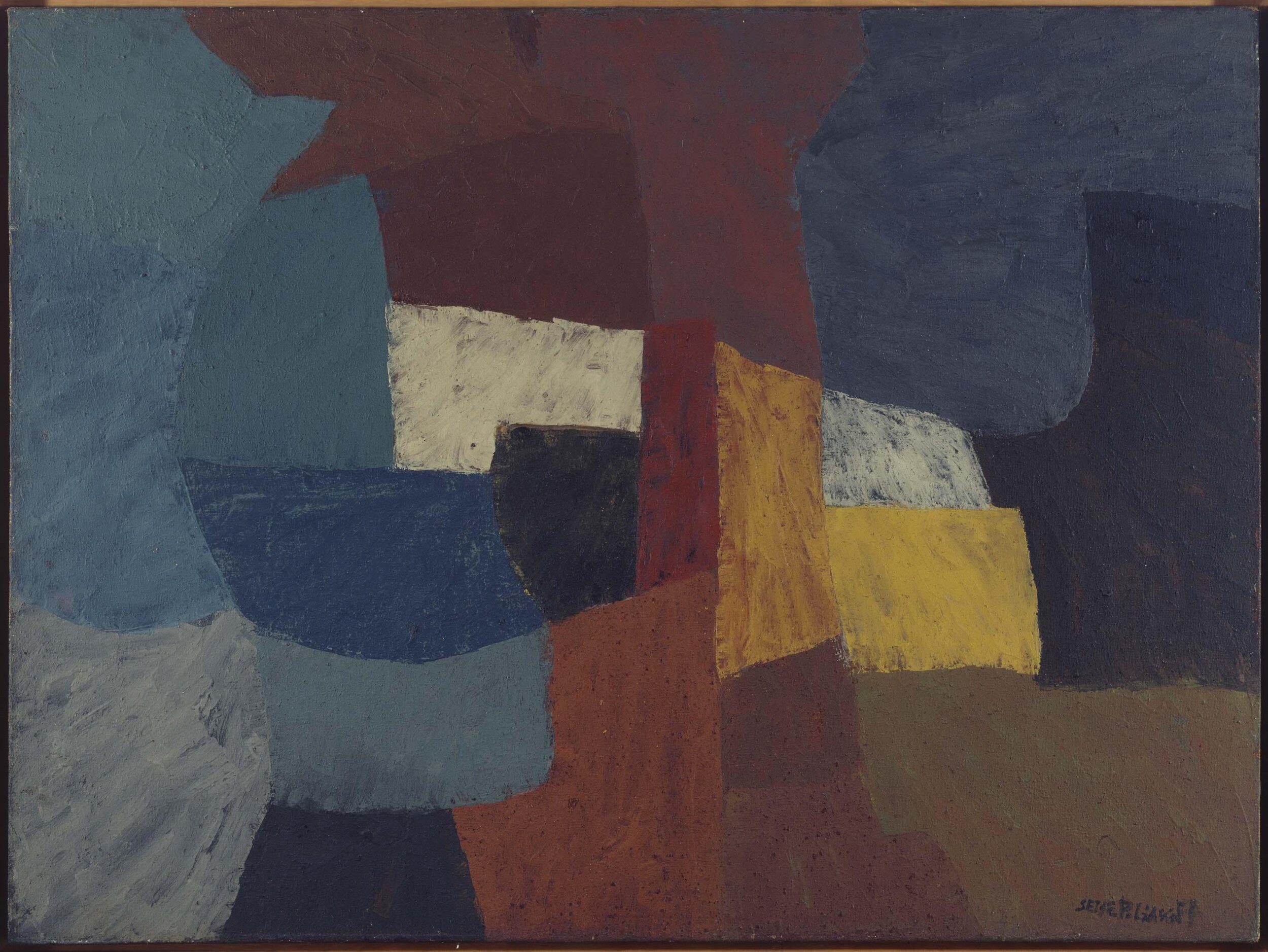
3. Area Rhythm is the amounts of the color-----large, medium, small. Here you want to establish a hierarchy of which color will be dominant (largest amount), which will be supportive (middle amount) and which will be an accent (small amount).
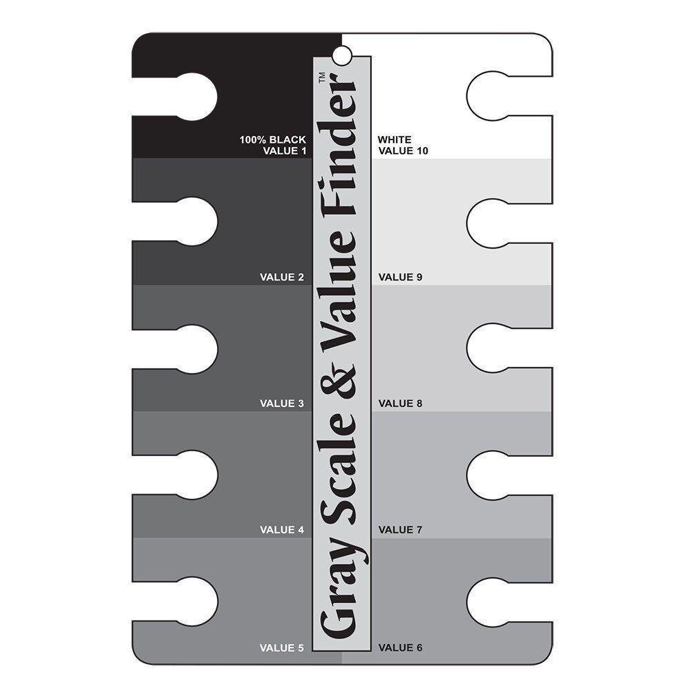
4. Value Rhythm – dark, medium, light (hues have different values and can be altered in value with white, black or its complementary
5. Transition rhythm – graduated continuous colors of the same hue
2020 July 7 - CLASS TOPIC OF COLOR RHYTHM VIDEO
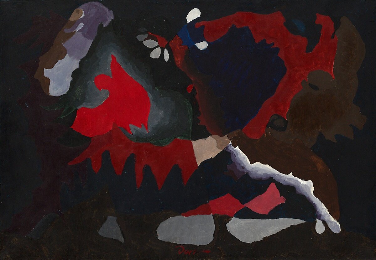
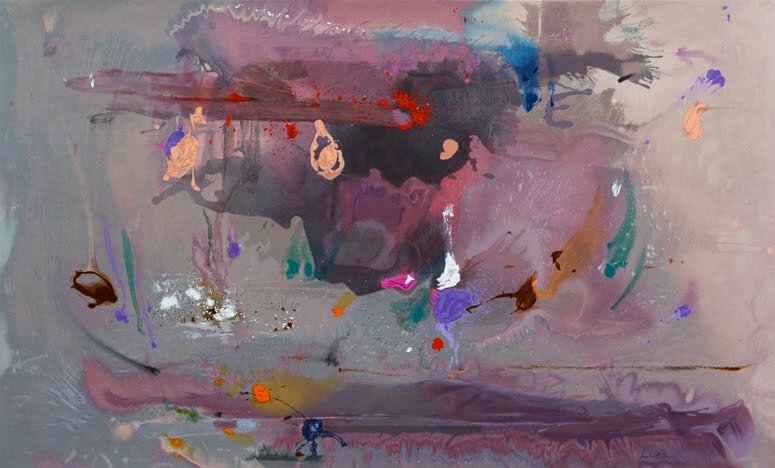
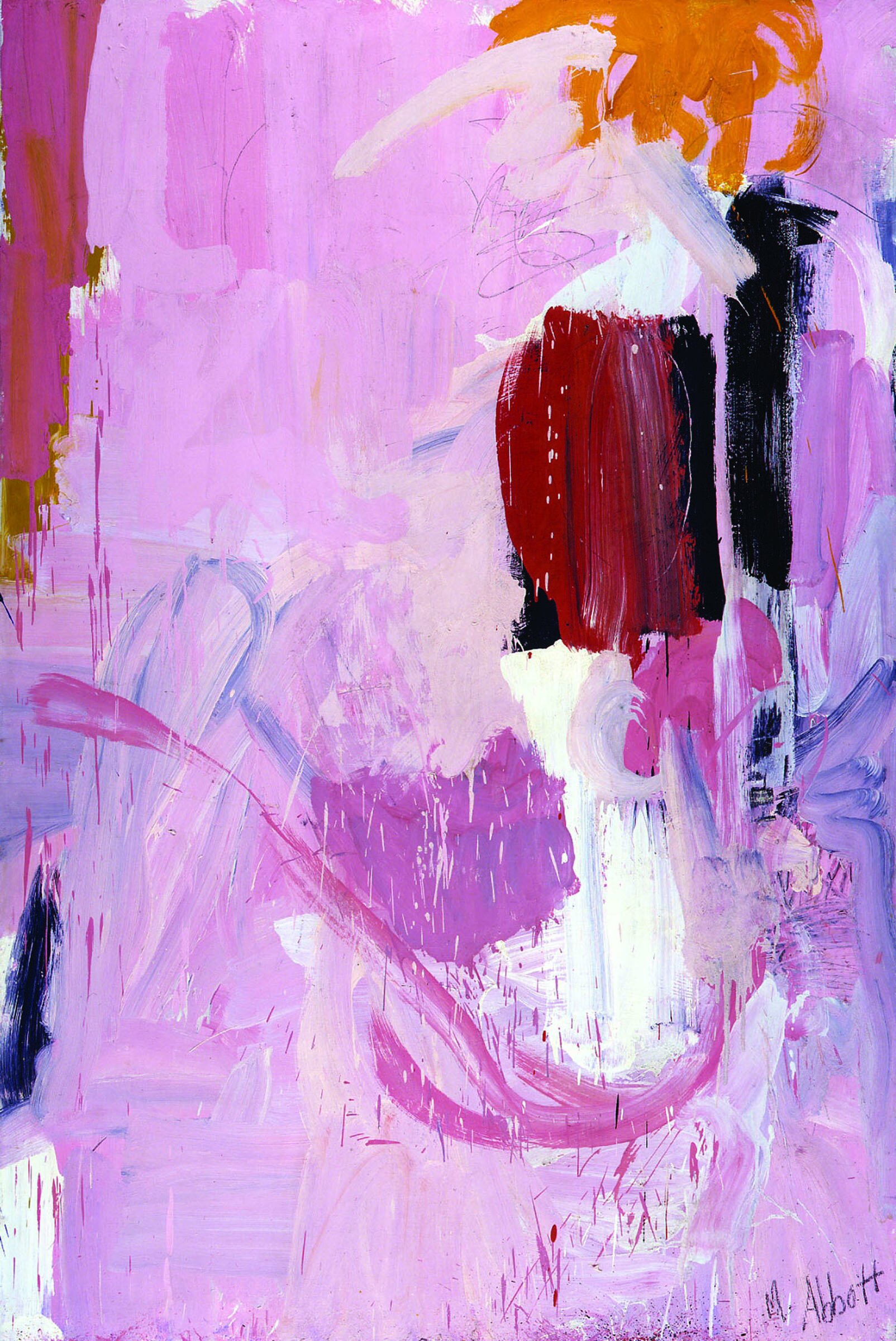
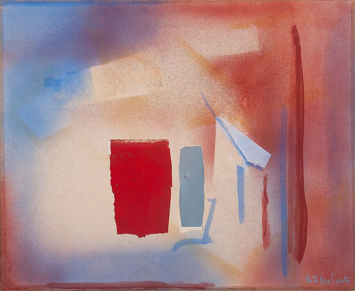
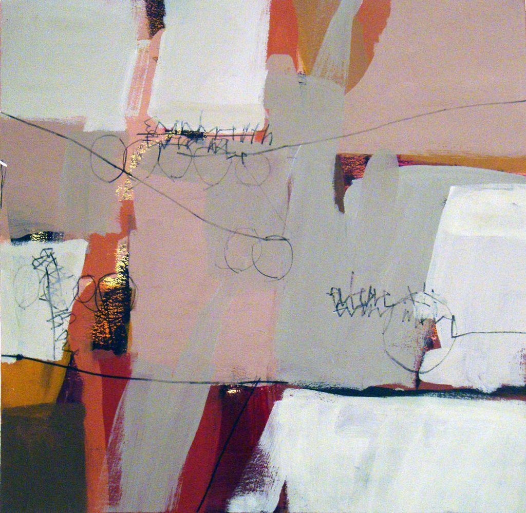
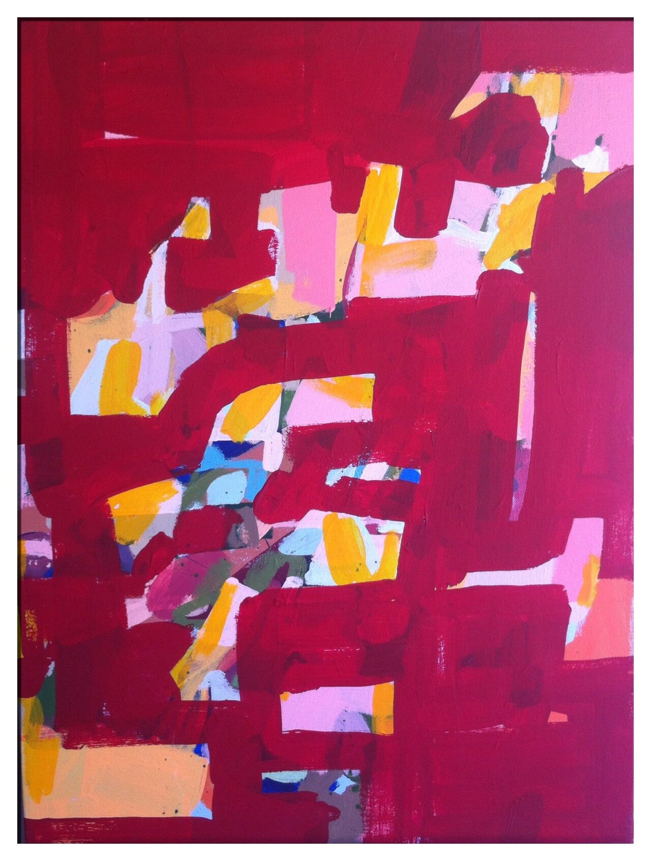
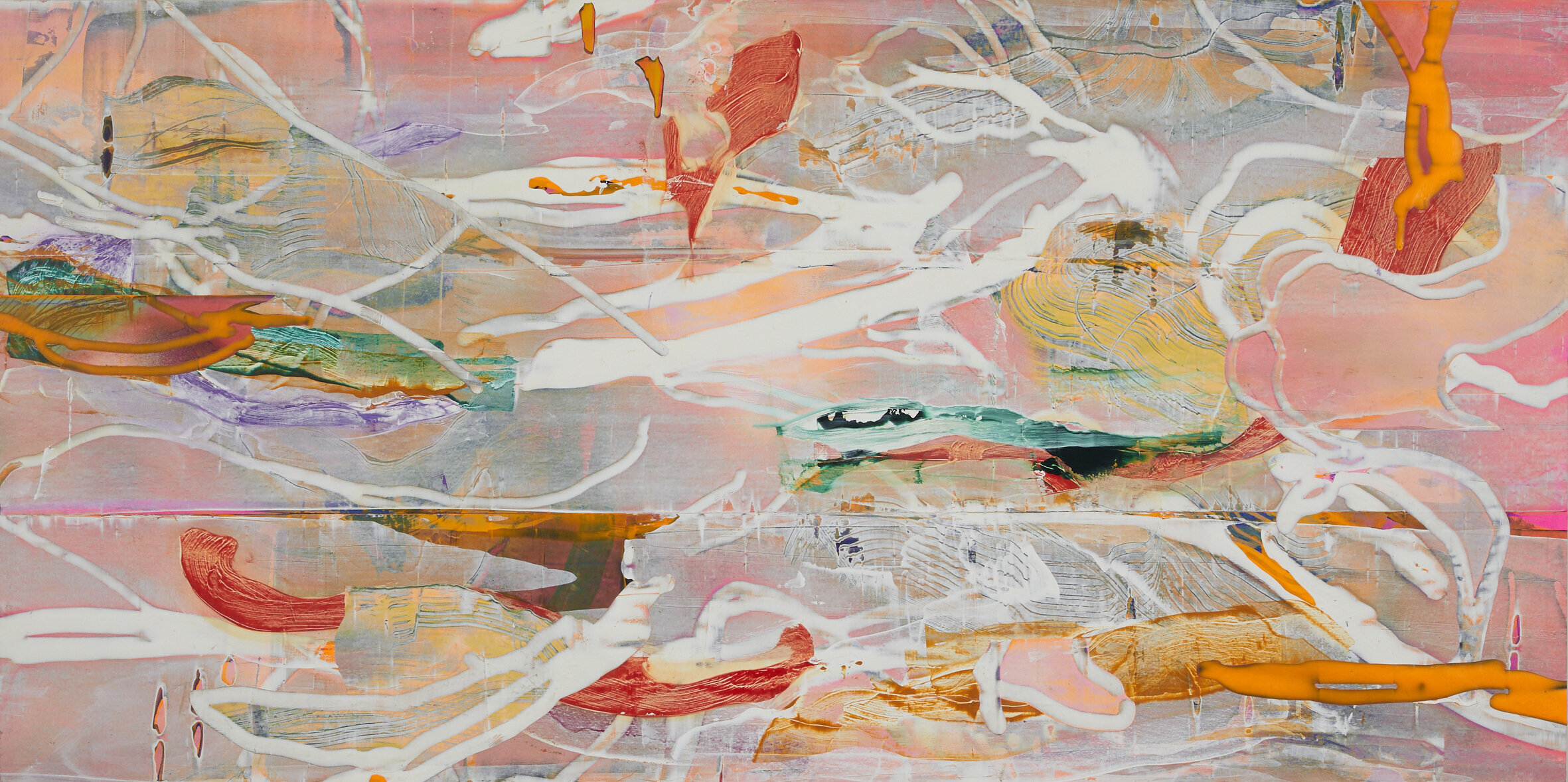
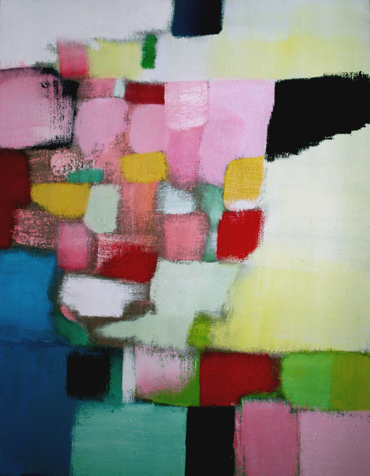
DESCRIBE YOUR PAINTING THROUGH COLOR
Think about your overall impression of the colors used in your painting, how they look and feel, how the colors work together (or not), how they fit with the subject of the painting, and whether you mixed them (or not).
1. Are there any specific colors or color palettes you can identify?
2. What is the overall temperature and key of the painting? Cool, cold, warm, hot, light, dark
3. Is there a clear color scheme? Complementary, contrasting, harmonious
4. What is the mood of the painting? Quiet, loud, peaceful, moody, etc.
5. What is the energy of the painting? Busy, calm, soothing, energetic, happy, etc.
6. Are the colors saturated, Bright, brilliant, deep, earthy, harmonious, intense, rich, saturated, strong, vibrant, vivid?
7. Are the colors muted, Dull, flat, insipid, pale, mellow, muted, subdued, quiet, weak
8. Are the colors Natural, clear, compatible, distinctive, lively, stimulating, subtle, sympathetic
9. Are the colors Artificial, clashing, depressing, discordant, garish, gaudy, jarring, unfriendly, violent
10. Are the colors Blended, broken, mixed, muddled, muddied, pure
11. Is there a color hierarchy?, color rhythm? Depth of color?
12. Does color draw you in and have you explore the whole image?
13. Is the color balanced and harmonized? Is there color unity?